Upgrade to Pro
— share decks privately, control downloads, hide ads and more …
Speaker Deck
Features
Speaker Deck
PRO
Sign in
Sign up for free
Search
Search
Responsive Web Design - Reinventando la web
Search
Sponsored
·
SiteGround - Reliable hosting with speed, security, and support you can count on.
→
Swwweet
April 27, 2012
Technology
15
4.7k
Responsive Web Design - Reinventando la web
Presentación de Javier Usobiaga en el Ideateca HTML5 DevUp 2012.
Swwweet
April 27, 2012
Tweet
Share
More Decks by Swwweet
See All by Swwweet
Wonders from the Full Stack Fest website
swwweet
1
360
How to be the best web designer in the world.
swwweet
6
1.3k
Design for loading
swwweet
5
550
Mobile First: as difficult as doing things right
swwweet
225
10k
One Size Fits None
swwweet
12
890
One Size Fits None - From the Front 2013
swwweet
2
740
Responsively Responsive
swwweet
23
1.6k
La letra con píxel entra
swwweet
0
1.2k
The future of code
swwweet
4
620
Other Decks in Technology
See All in Technology
コンテナセキュリティの最新事情 ~ 2026年版 ~
kyohmizu
2
160
CDKで始めるTypeScript開発のススメ
tsukuboshi
1
500
AIエージェントを開発しよう!-AgentCore活用の勘所-
yukiogawa
0
170
StrandsとNeptuneを使ってナレッジグラフを構築する
yakumo
1
120
OpenShiftでllm-dを動かそう!
jpishikawa
0
130
Contract One Engineering Unit 紹介資料
sansan33
PRO
0
13k
usermode linux without MMU - fosdem2026 kernel devroom
thehajime
0
240
配列に見る bash と zsh の違い
kazzpapa3
3
160
ランサムウェア対策としてのpnpm導入のススメ
ishikawa_satoru
0
190
コミュニティが変えるキャリアの地平線:コロナ禍新卒入社のエンジニアがAWSコミュニティで見つけた成長の羅針盤
kentosuzuki
0
130
こんなところでも(地味に)活躍するImage Modeさんを知ってるかい?- Image Mode for OpenShift -
tsukaman
1
160
顧客との商談議事録をみんなで読んで顧客解像度を上げよう
shibayu36
0
260
Featured
See All Featured
A Guide to Academic Writing Using Generative AI - A Workshop
ks91
PRO
0
210
Lessons Learnt from Crawling 1000+ Websites
charlesmeaden
PRO
1
1.1k
WENDY [Excerpt]
tessaabrams
9
36k
The Success of Rails: Ensuring Growth for the Next 100 Years
eileencodes
47
7.9k
Fashionably flexible responsive web design (full day workshop)
malarkey
408
66k
The State of eCommerce SEO: How to Win in Today's Products SERPs - #SEOweek
aleyda
2
9.6k
Speed Design
sergeychernyshev
33
1.5k
Responsive Adventures: Dirty Tricks From The Dark Corners of Front-End
smashingmag
254
22k
Building Adaptive Systems
keathley
44
2.9k
From π to Pie charts
rasagy
0
120
Measuring Dark Social's Impact On Conversion and Attribution
stephenakadiri
1
130
The Art of Programming - Codeland 2020
erikaheidi
57
14k
Transcript
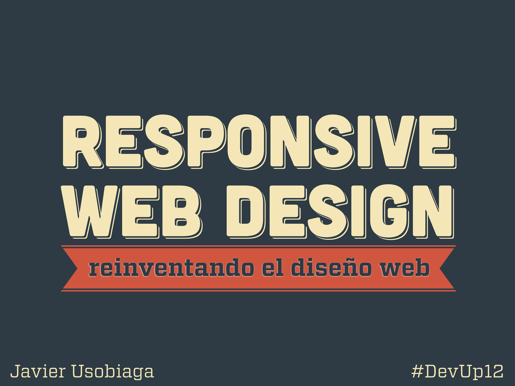
RESPoNSIVE WEB DESIGN RESPoNSIVE WEB DESIGN RESPoNSIVE WEB DESIGN reinventando
el diseño web Javier Usobiaga #DevUp12
@htmlboy @htmlboy @htmlboy trabajo en Swwweet.com
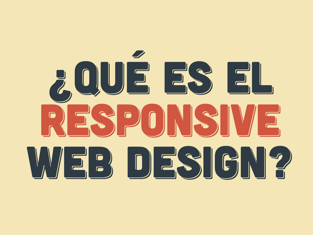
¿Qué es el responsive web design? ¿Qué es el responsive
web design? ¿Qué es el respoNsive web design?
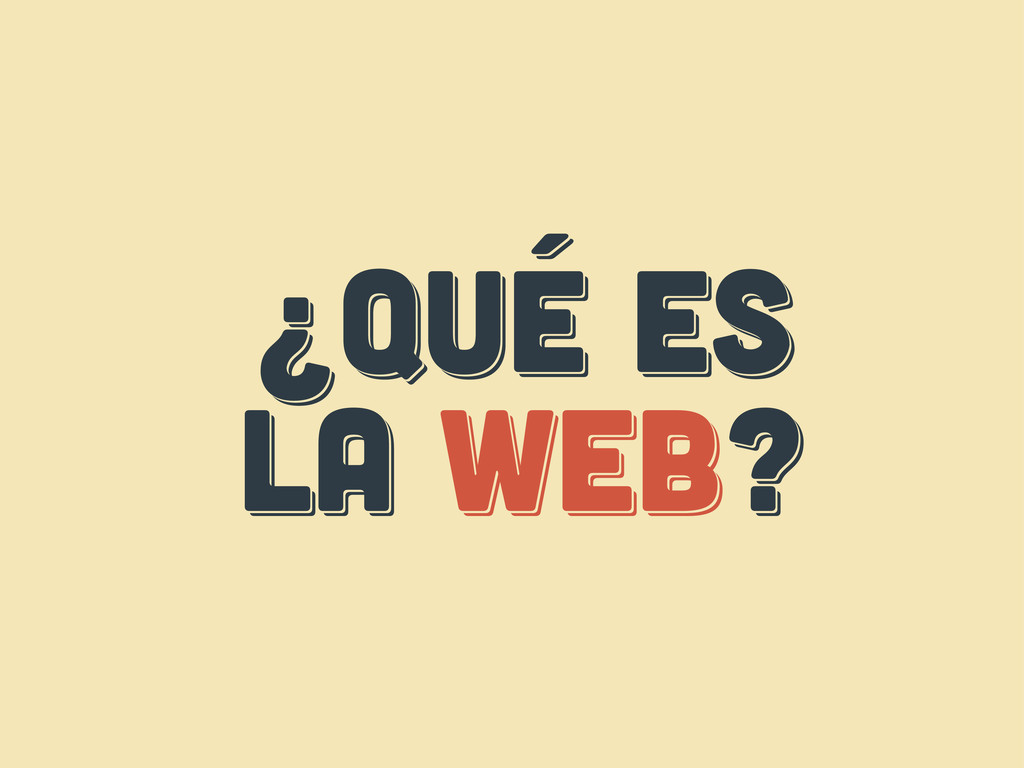
¿Qué es LA web? ¿Qué es LA web? ¿Qué es
LA web?
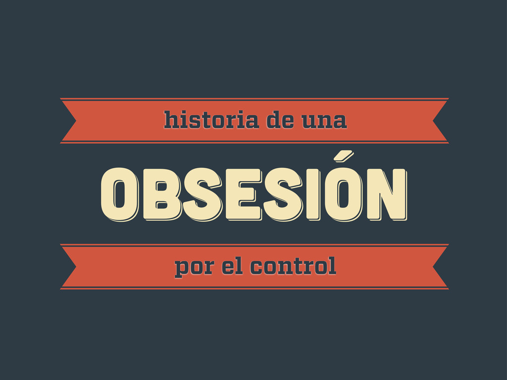
obsesión obsesión historia de una obsesión por el control
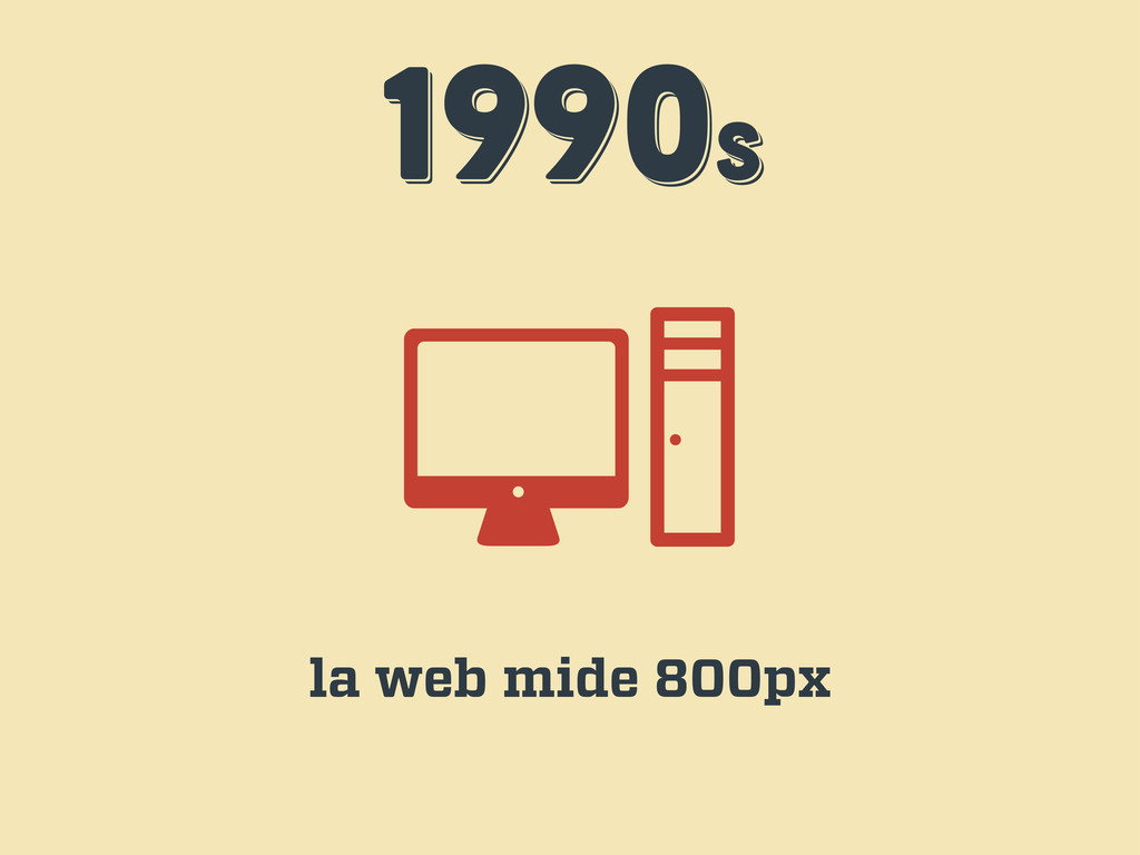
1990s 1990s 1990s la web mide 800px
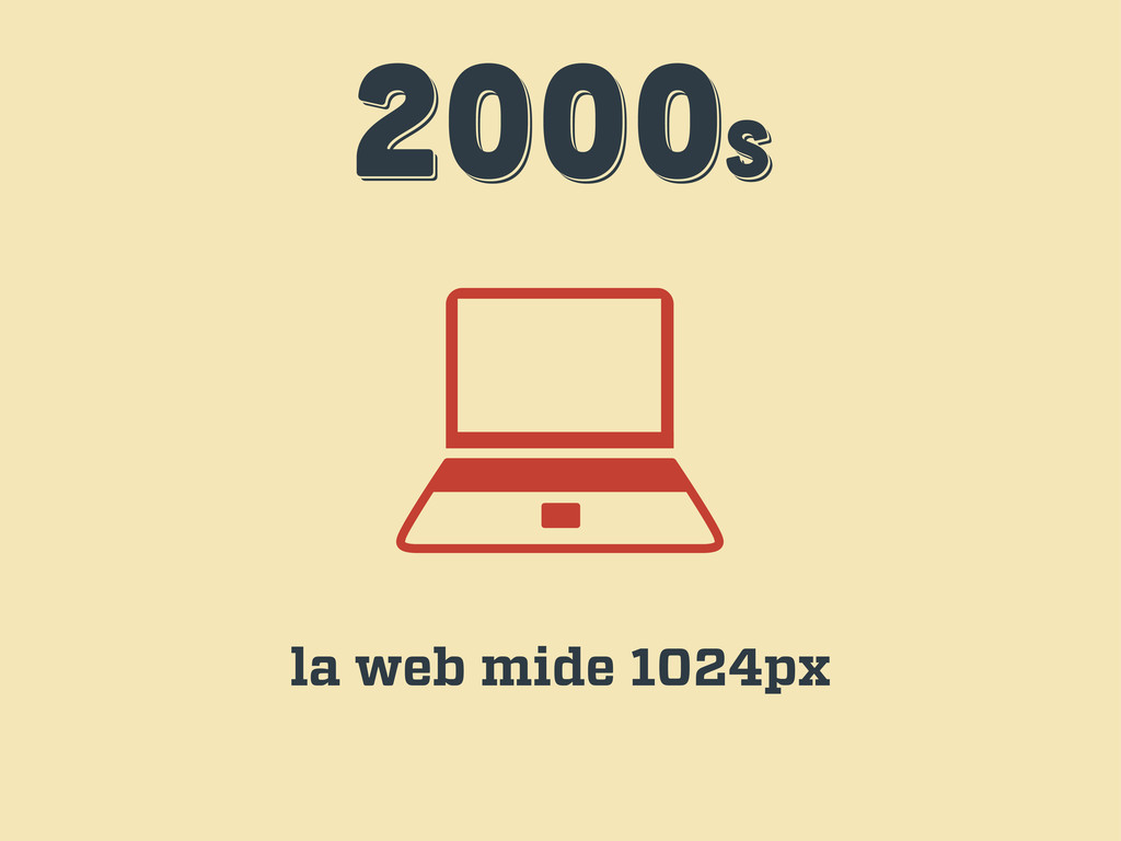
2000s 2000s 2000s la web mide 1024px
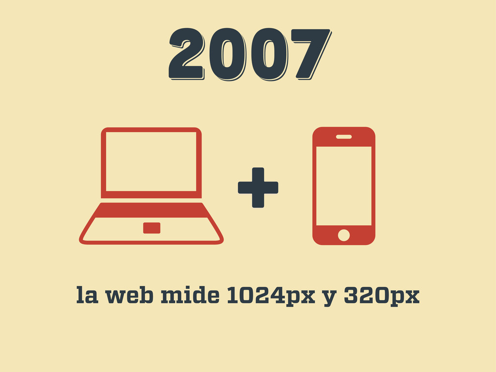
2007 2007 2007 + la web mide 1024px y 320px
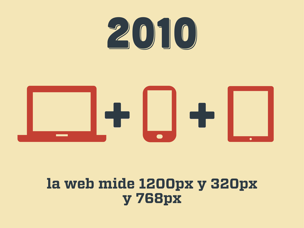
2010 2010 2010 + + la web mide 1200px y
320px y 768px
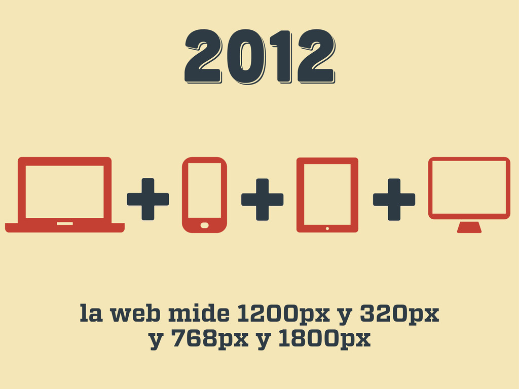
2012 2012 2012 + + la web mide 1200px y
320px y 768px y 1800px +
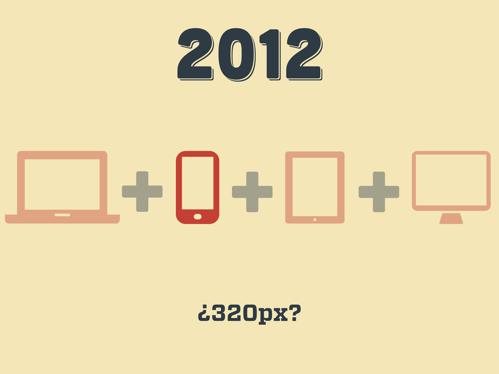
2012 2012 2012 + + ¿320px? +
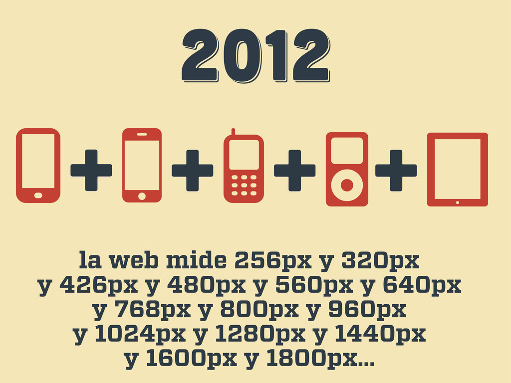
2012 2012 2012 la web mide 256px y 320px y
426px y 480px y 560px y 640px y 768px y 800px y 960px y 1024px y 1280px y 1440px y 1600px y 1800px… + + + +
¡BASTA! ¡BASTA! ¡BASTA! es hora de aceptar la naturaleza de
la web
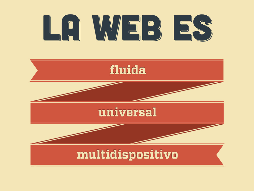
LA WEB ES LA WEB ES LA WEB ES fluida
universal multidispositivo
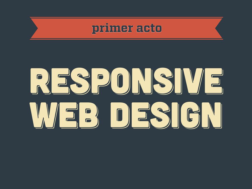
primer acto RESPoNSIVE WEB DESIGN RESPoNSIVE WEB DESIGN RESPoNSIVE WEB
DESIGN
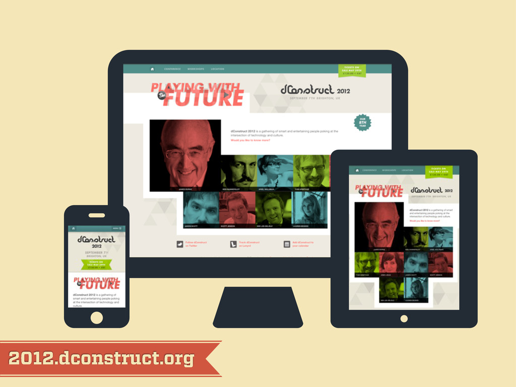
2012.dconstruct.org
mediaqueri.es
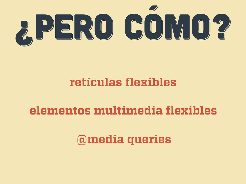
¿PERO CÓMO? ¿PERO CÓMO? ¿PERO CÓMO? retículas flexibles elementos multimedia
flexibles @media queries
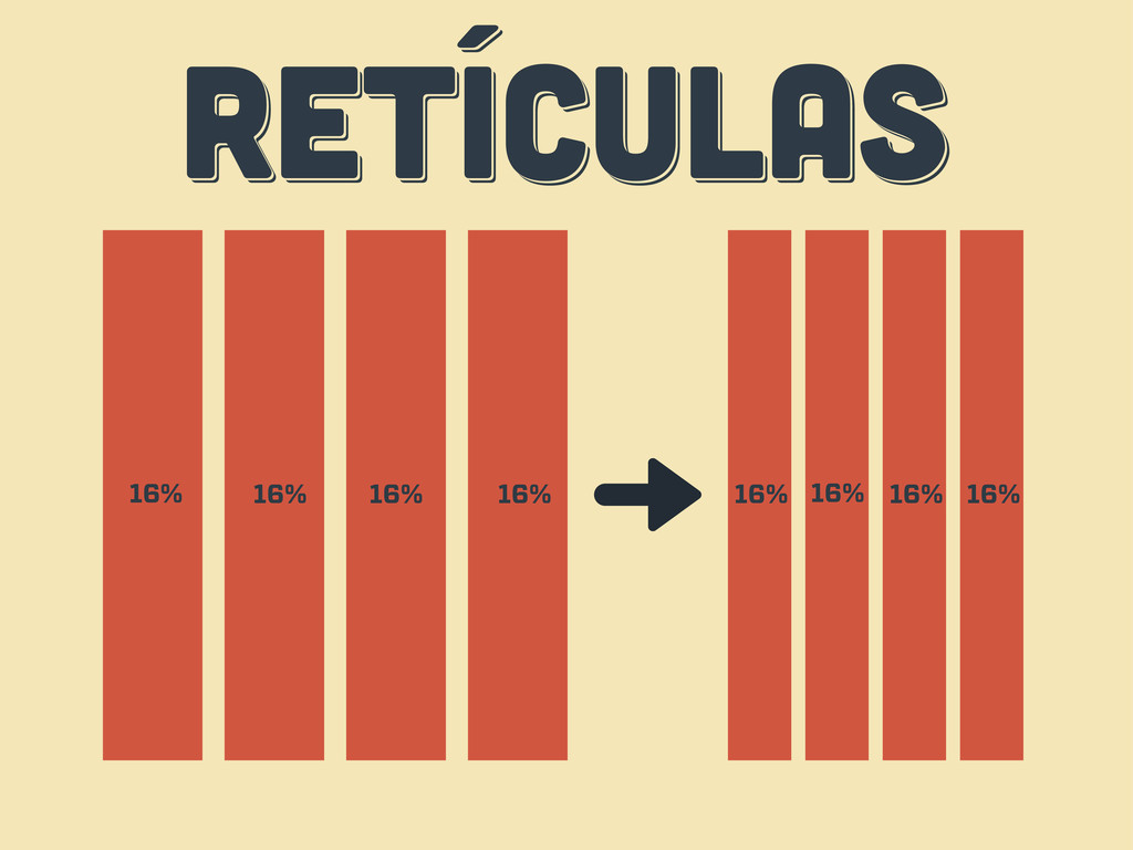
RETÍCULAS RETÍCULAS RETÍCULAS 16% 16% 16% 16% 16% 16% 16%
16%
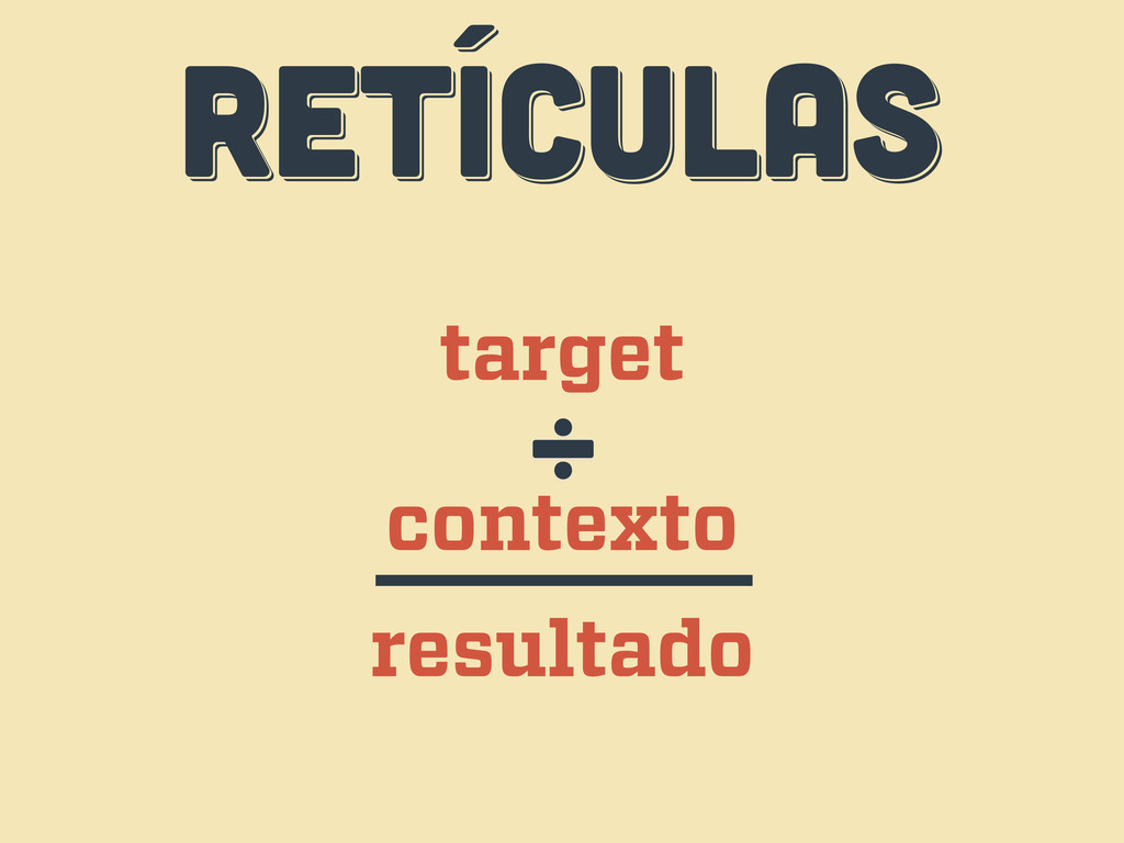
RETÍCULAS RETÍCULAS RETÍCULAS target contexto ÷ resultado
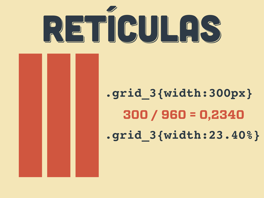
RETÍCULAS RETÍCULAS RETÍCULAS .grid_3{width:300px} 300 / 960 = 0,2340 .grid_3{width:23.40%}
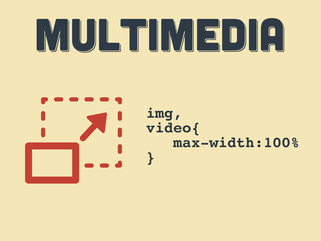
MULTIMEDIA MULTIMEDIA MULTIMEDIA img, video{ max-width:100% }
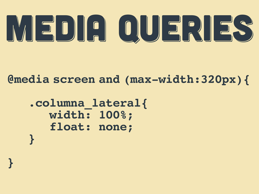
MEDIA QUERIES MEDIA QUERIES MEDIA QUERIES @media screen and (max-width:320px){
.columna_lateral{ width: 100%; float: none; } }
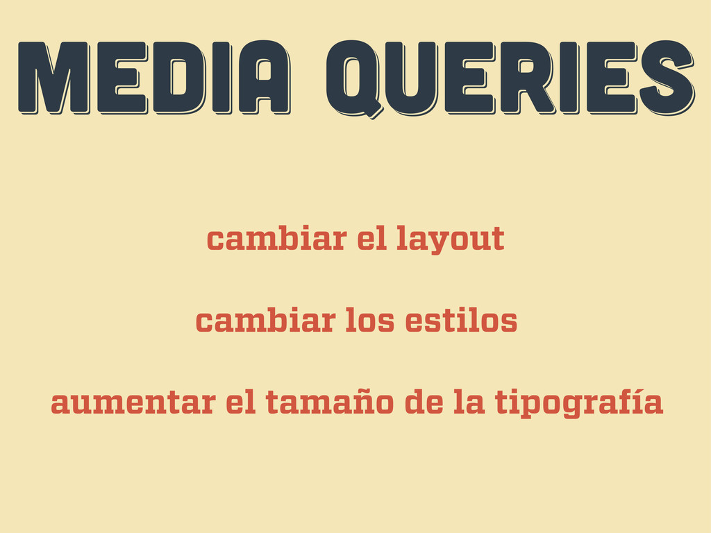
MEDIA QUERIES MEDIA QUERIES MEDIA QUERIES cambiar el layout cambiar
los estilos aumentar el tamaño de la tipografía
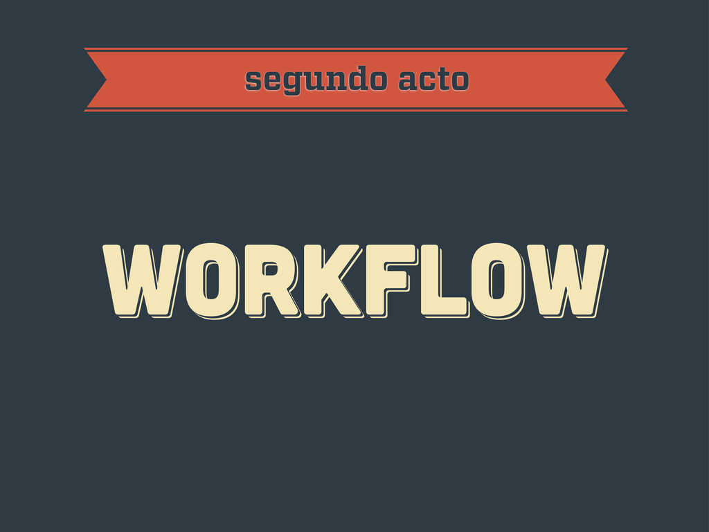
workflow workflow workflow segundo acto
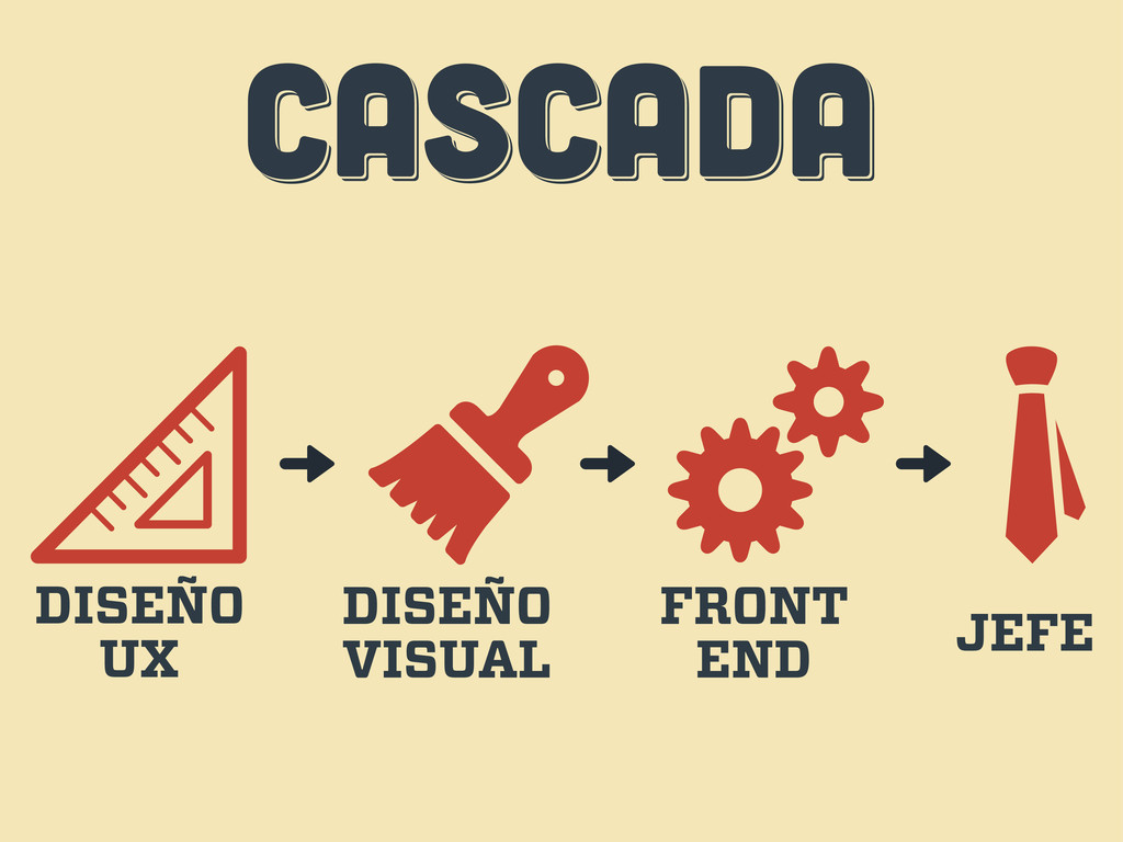
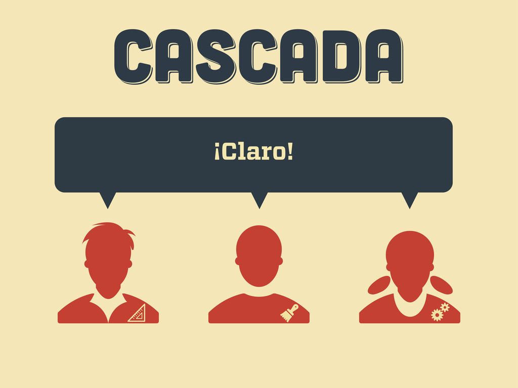
CASCADA CASCADA CASCADA DISEÑO UX DISEÑO VISUAL FRONT END JEFE
CASCADA CASCADA CASCADA Hola, quería una web...
CASCADA CASCADA CASCADA ¡Claro!
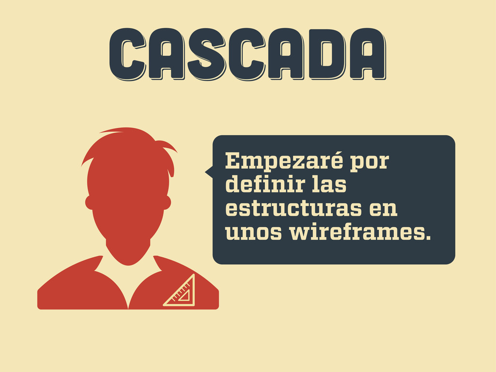
CASCADA CASCADA CASCADA Empezaré por definir las estructuras en unos
wireframes.
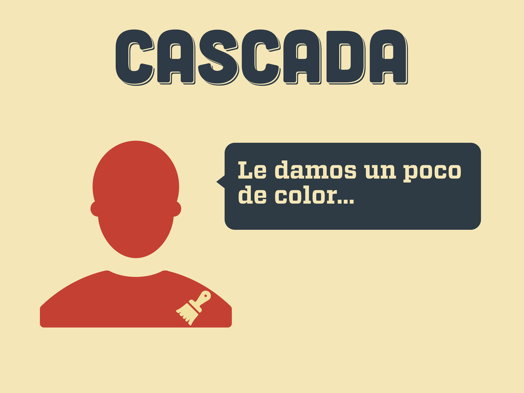
CASCADA CASCADA CASCADA Le damos un poco de color...
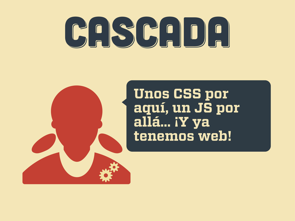
CASCADA CASCADA CASCADA Unos CSS por aquí, un JS por
allá... ¡Y ya tenemos web!
CASCADA CASCADA CASCADA Uh... esto...
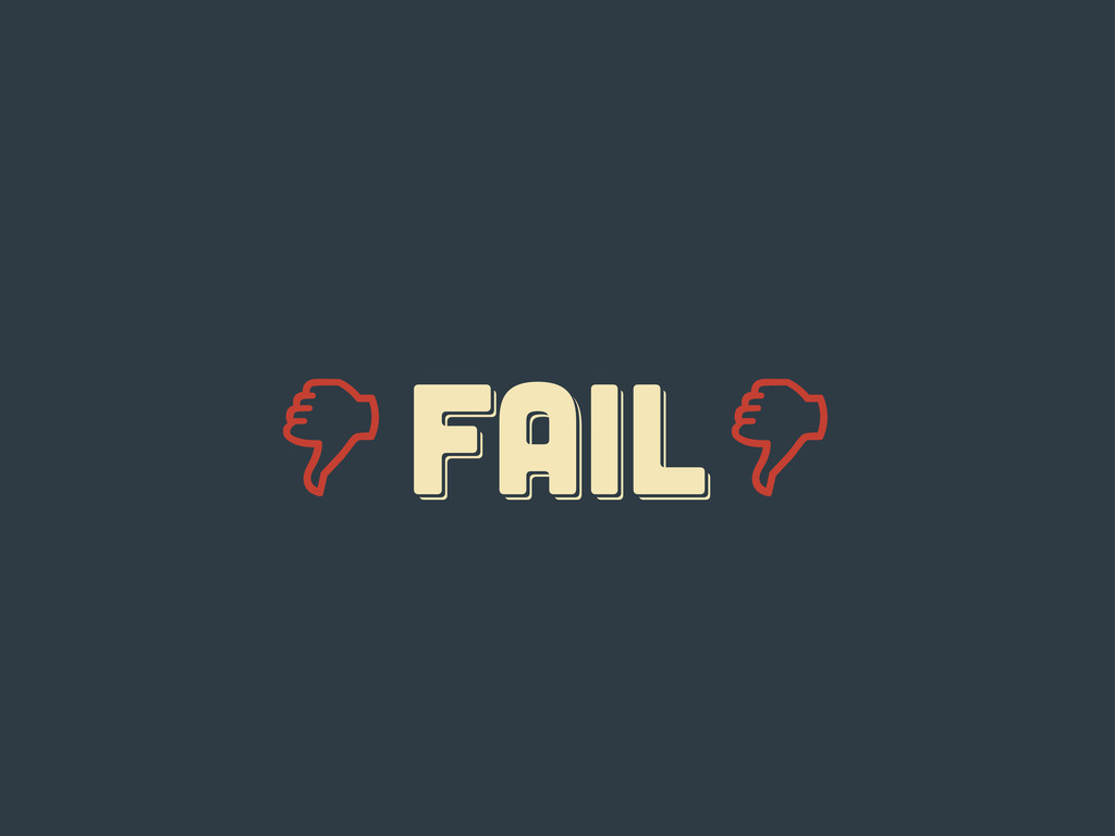
FAIL fail Fail
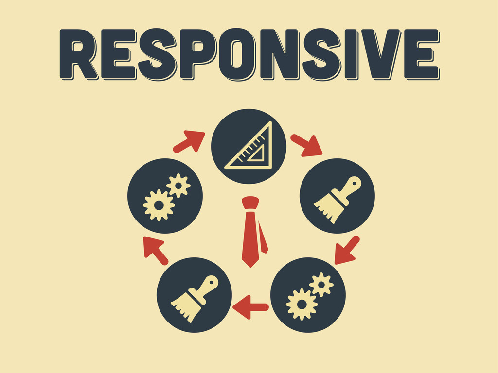
responsive responsive Responsive
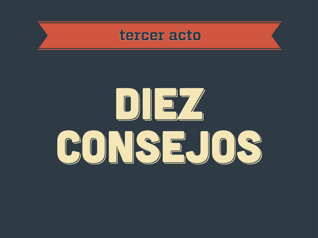
diez consejos diez consejos diez consejos tercer acto
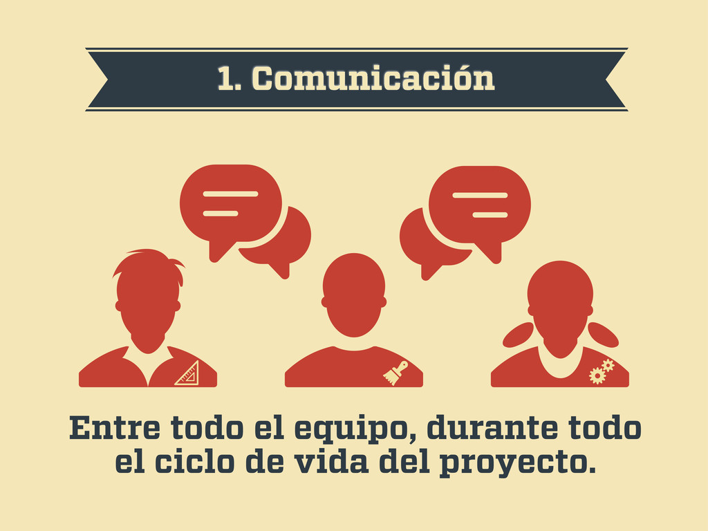
1. Comunicación Entre todo el equipo, durante todo el ciclo
de vida del proyecto.
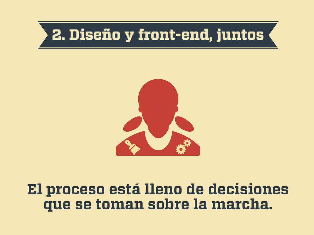
2. Diseño y front-end, juntos El proceso está lleno de
decisiones que se toman sobre la marcha.
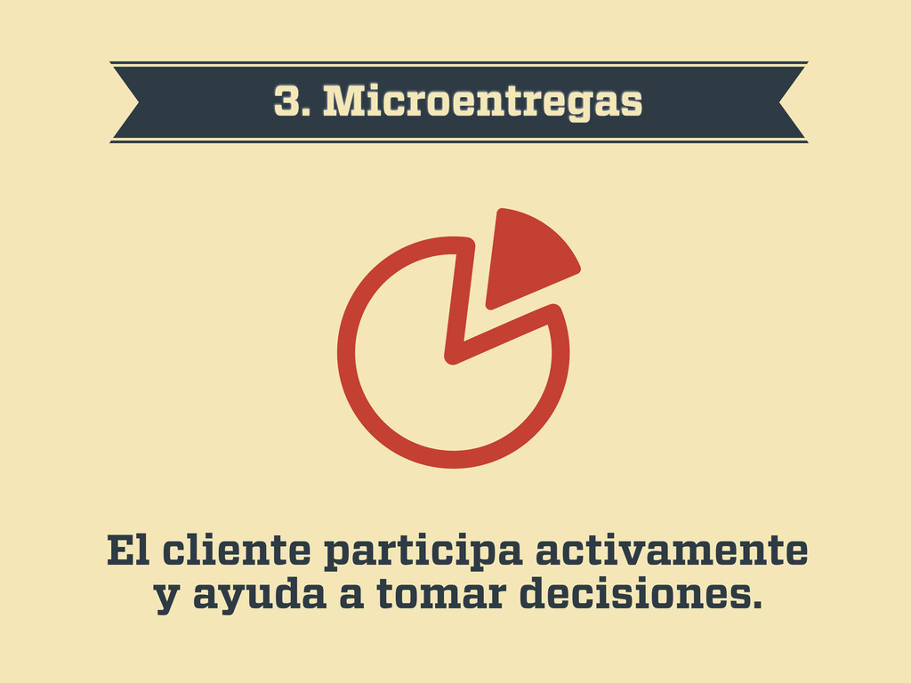
3. Microentregas El cliente participa activamente y ayuda a tomar
decisiones.
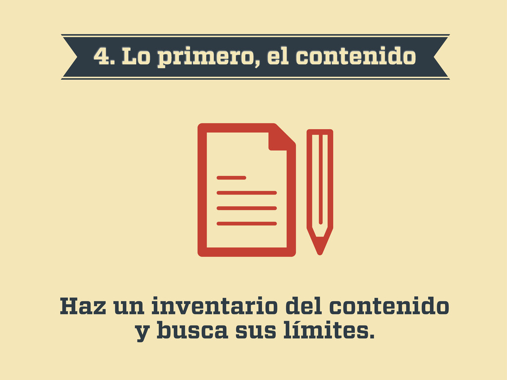
4. Lo primero, el contenido Haz un inventario del contenido
y busca sus límites.
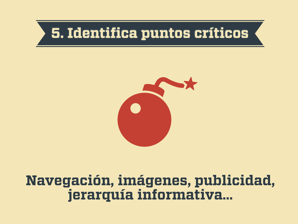
5. Identifica puntos críticos Navegación, imágenes, publicidad, jerarquía informativa…
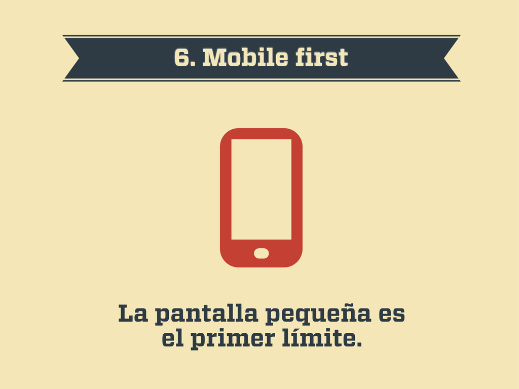
6. Mobile first La pantalla pequeña es el primer límite.
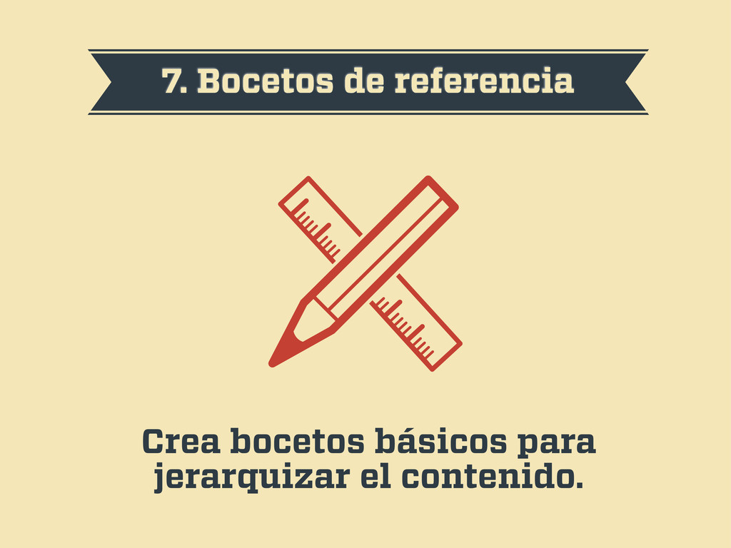
7. Bocetos de referencia Crea bocetos básicos para jerarquizar el
contenido.
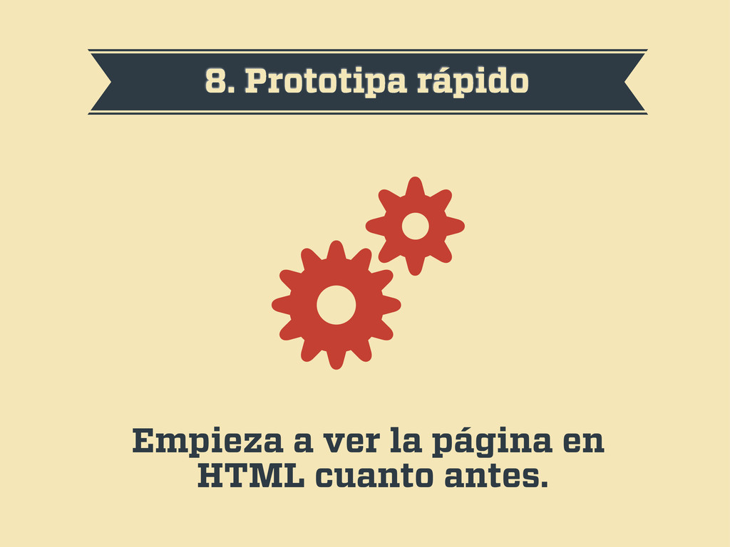
8. Prototipa rápido Empieza a ver la página en HTML
cuanto antes.
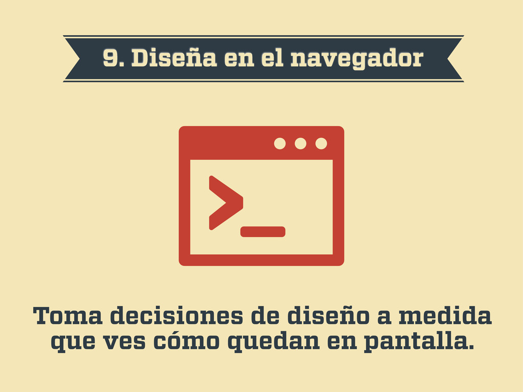
9. Diseña en el navegador Toma decisiones de diseño a
medida que ves cómo quedan en pantalla.
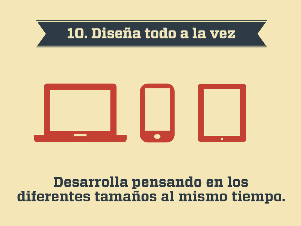
10. Diseña todo a la vez Desarrolla pensando en los
diferentes tamaños al mismo tiempo.
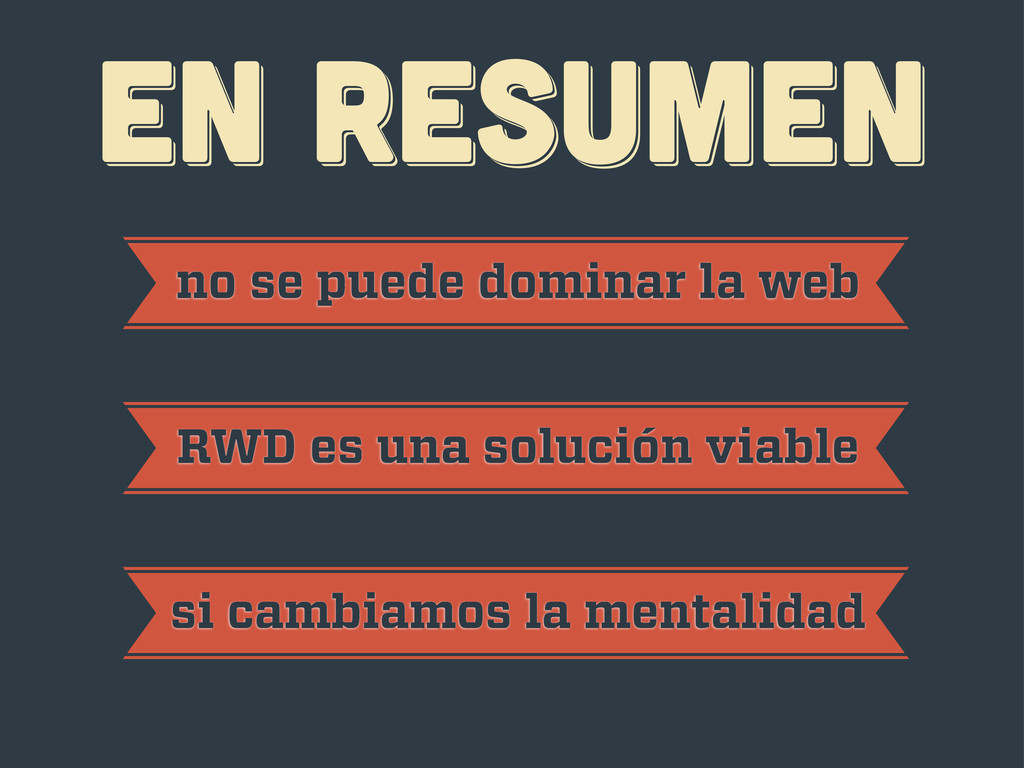
EN RESUMEN EN RESUMEN EN RESUMEN no se puede dominar
la web RWD es una solución viable si cambiamos la mentalidad
¡gracias! ¡gracias! ¡gracias! Javier Usobiaga · http://Swwweet.com · @htmlboy
 SiteGround - Reliable hosting with speed, security, and support you can count on.
 swwweet
 kyohmizu
 tsukuboshi
 yukiogawa
 yakumo
 jpishikawa
 sansan33
 thehajime
 kazzpapa3
 ishikawa_satoru
 kentosuzuki
 tsukaman
 shibayu36
 ks91
ks91
 charlesmeaden
 tessaabrams
 eileencodes
 malarkey
 aleyda
 sergeychernyshev
 smashingmag
 keathley
 rasagy
 stephenakadiri
 erikaheidi