Upgrade to Pro
— share decks privately, control downloads, hide ads and more …
Speaker Deck
Features
Speaker Deck
PRO
Sign in
Sign up for free
Search
Search
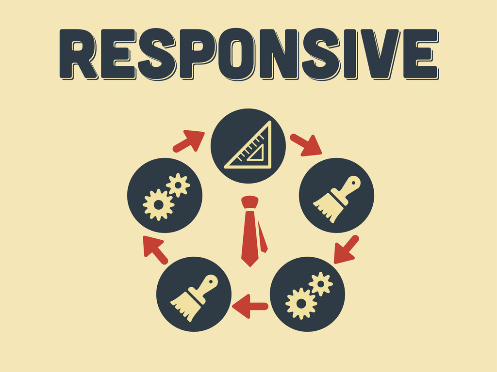
Responsive Web Design: Everything has Changed
Search
Swwweet
June 17, 2012
Technology
6
730
Responsive Web Design: Everything has Changed
Presentation by @htmlboy at Drupal Developers Day Barcelona 2012.
Swwweet
June 17, 2012
Tweet
Share
More Decks by Swwweet
See All by Swwweet
Wonders from the Full Stack Fest website
swwweet
1
360
How to be the best web designer in the world.
swwweet
6
1.3k
Design for loading
swwweet
5
550
Mobile First: as difficult as doing things right
swwweet
225
10k
One Size Fits None
swwweet
12
890
One Size Fits None - From the Front 2013
swwweet
2
740
Responsively Responsive
swwweet
23
1.6k
La letra con píxel entra
swwweet
0
1.2k
The future of code
swwweet
4
620
Other Decks in Technology
See All in Technology
プロポーザルに込める段取り八分
shoheimitani
1
280
StrandsとNeptuneを使ってナレッジグラフを構築する
yakumo
1
120
20260208_第66回 コンピュータビジョン勉強会
keiichiito1978
0
140
ZOZOにおけるAI活用の現在 ~開発組織全体での取り組みと試行錯誤~
zozotech
PRO
5
5.6k
データの整合性を保ちたいだけなんだ
shoheimitani
8
3.1k
15 years with Rails and DDD (AI Edition)
andrzejkrzywda
0
190
顧客との商談議事録をみんなで読んで顧客解像度を上げよう
shibayu36
0
240
Digitization部 紹介資料
sansan33
PRO
1
6.8k
CDKで始めるTypeScript開発のススメ
tsukuboshi
1
440
All About Sansan – for New Global Engineers
sansan33
PRO
1
1.3k
OWASP Top 10:2025 リリースと 少しの日本語化にまつわる裏話
okdt
PRO
3
770
Kiro IDEのドキュメントを全部読んだので地味だけどちょっと嬉しい機能を紹介する
khmoryz
0
200
Featured
See All Featured
Claude Code のすすめ
schroneko
67
210k
Future Trends and Review - Lecture 12 - Web Technologies (1019888BNR)
signer
PRO
0
3.2k
Dealing with People You Can't Stand - Big Design 2015
cassininazir
367
27k
Odyssey Design
rkendrick25
PRO
1
500
Utilizing Notion as your number one productivity tool
mfonobong
3
220
Building a Modern Day E-commerce SEO Strategy
aleyda
45
8.7k
How to Ace a Technical Interview
jacobian
281
24k
Code Reviewing Like a Champion
maltzj
527
40k
職位にかかわらず全員がリーダーシップを発揮するチーム作り / Building a team where everyone can demonstrate leadership regardless of position
madoxten
57
50k
The Art of Programming - Codeland 2020
erikaheidi
57
14k
Tips & Tricks on How to Get Your First Job In Tech
honzajavorek
0
440
Game over? The fight for quality and originality in the time of robots
wayneb77
1
120
Transcript
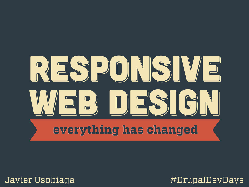
RESPoNSIVE WEB DESIGN RESPoNSIVE WEB DESIGN RESPoNSIVE WEB DESIGN everything
has changed Javier Usobiaga #DrupalDevDays
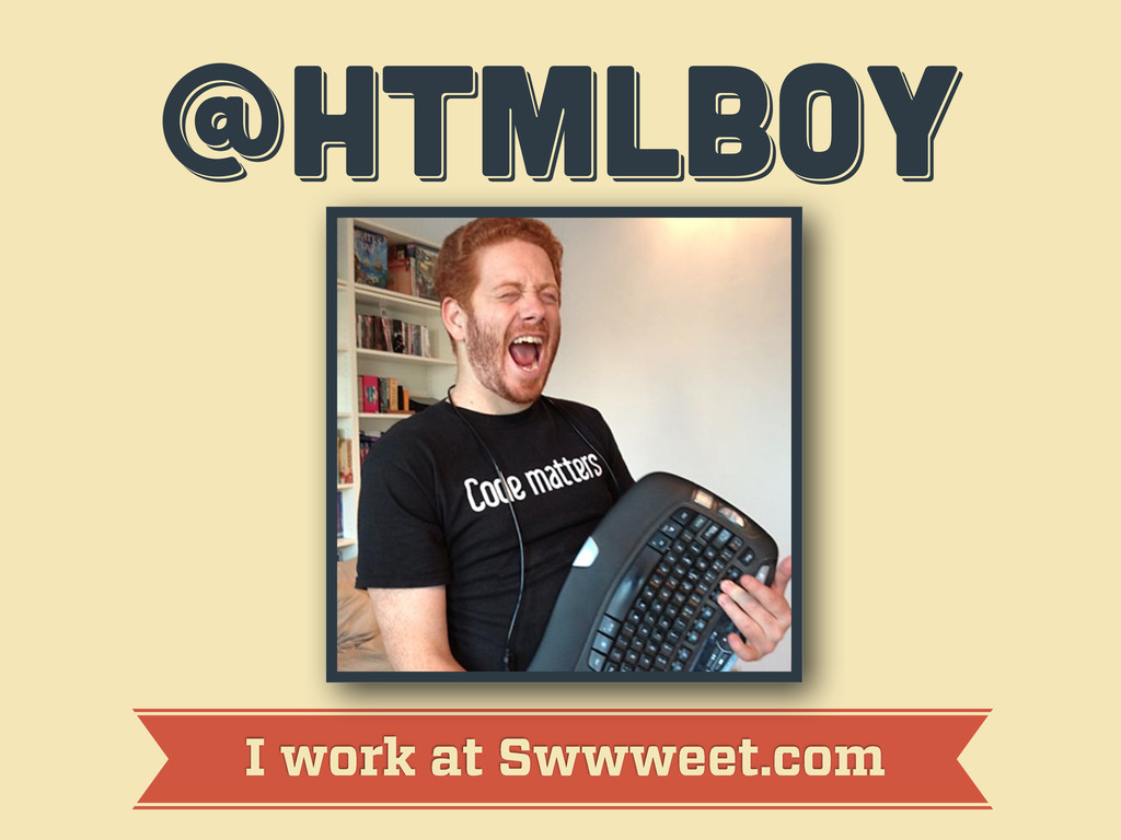
@htmlboy @htmlboy @htmlboy I work at Swwweet.com
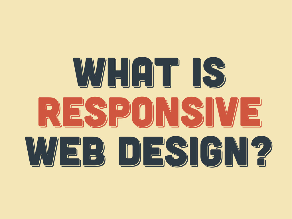
WHAT IS responsive web design? WHAT IS responsive web design?
WHAT IS respoNsive web design?
WHAT IS THE web? WHAT IS THE web? WHAT IS
THE web?
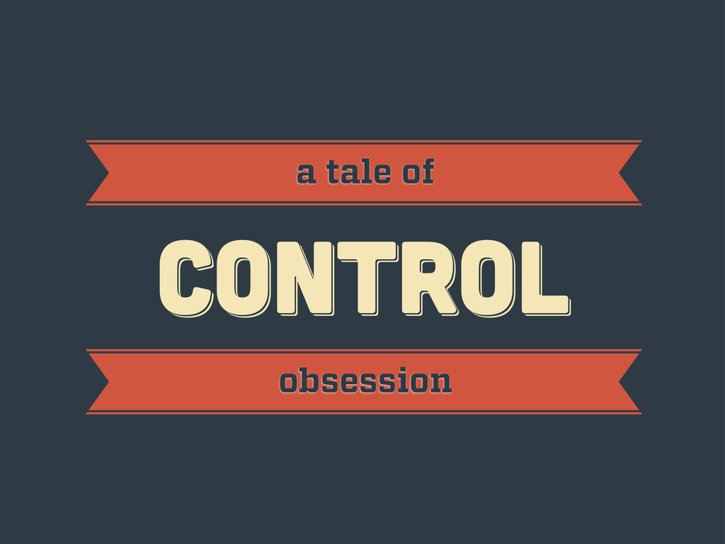
CONTROL CONTROL CONTROL a tale of obsession
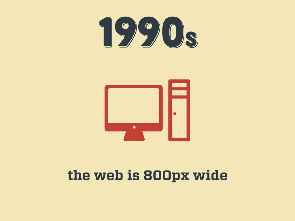
1990s 1990s 1990s the web is 800px wide
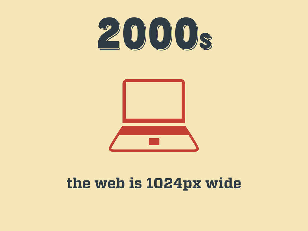
2000s 2000s 2000s the web is 1024px wide
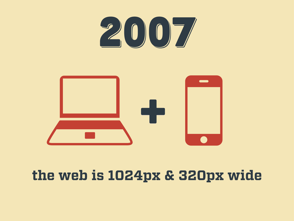
2007 2007 2007 + the web is 1024px & 320px
wide
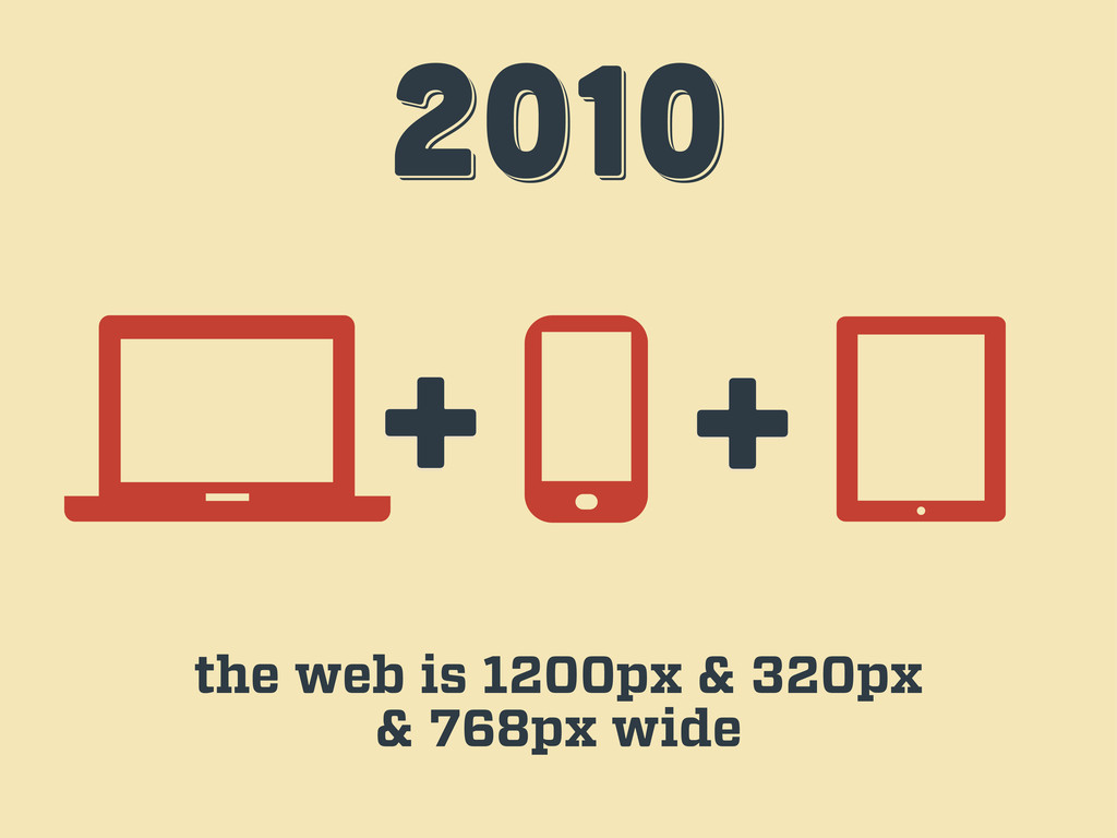
2010 2010 2010 + + the web is 1200px &
320px & 768px wide
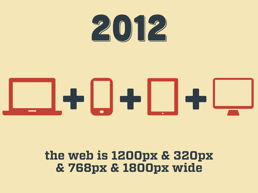
2012 2012 2012 + + the web is 1200px &
320px & 768px & 1800px wide +
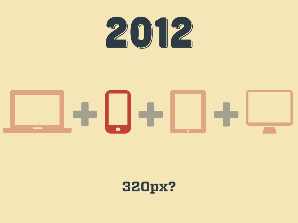
2012 2012 2012 + + 320px? +
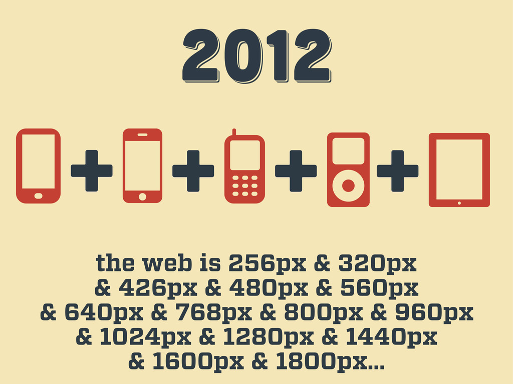
2012 2012 2012 the web is 256px & 320px &
426px & 480px & 560px & 640px & 768px & 800px & 960px & 1024px & 1280px & 1440px & 1600px & 1800px… + + + +
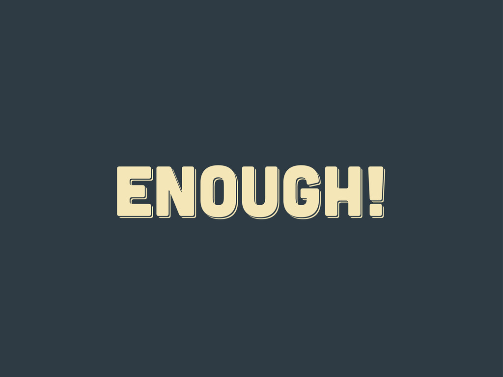
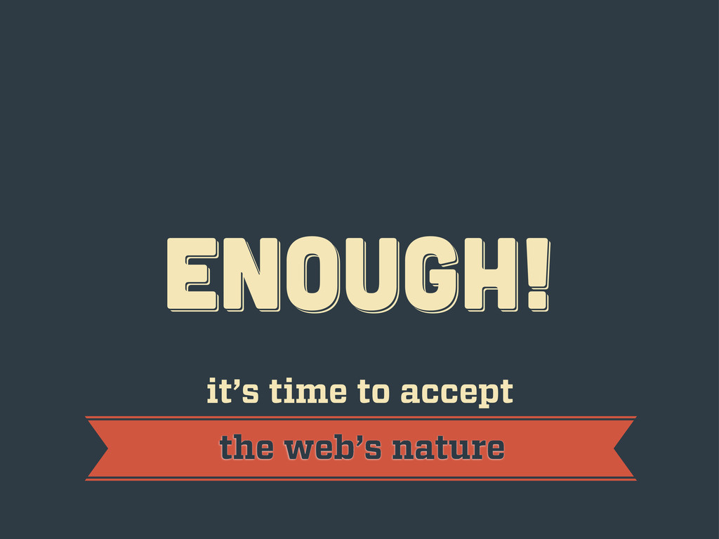
ENOUGH! ENOUGH! ENOUGH!
ENOUGH! ENOUGH! ENOUGH! it’s time to accept the web’s nature
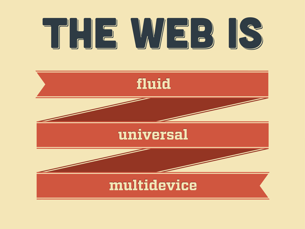
THE WEB IS THE WEB IS THE WEB IS fluid
universal multidevice
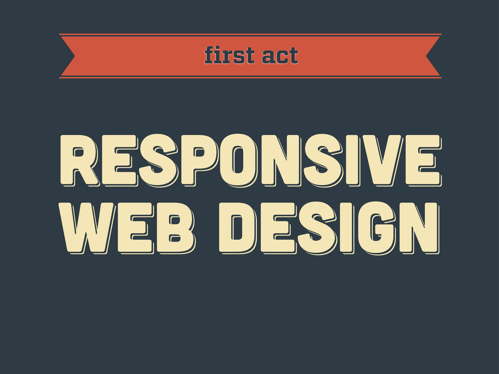
first act RESPoNSIVE WEB DESIGN RESPoNSIVE WEB DESIGN RESPoNSIVE WEB
DESIGN
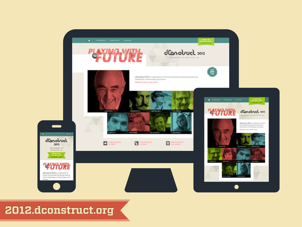
2012.dconstruct.org
mediaqueri.es
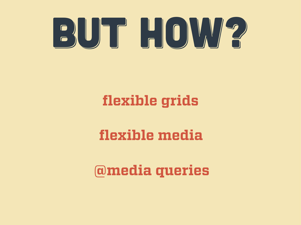
BUT HOW? BUT HOW? BUT HOW? flexible grids flexible media
@media queries
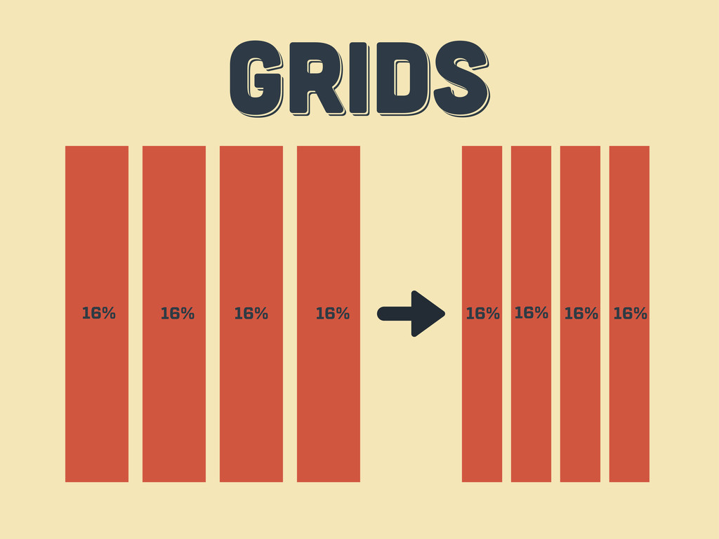
GRIDS GRIDS GRIDS 16% 16% 16% 16% 16% 16% 16%
16%
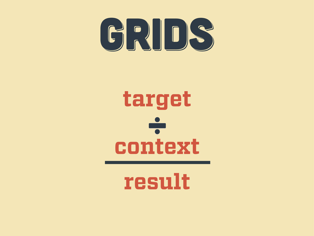
target context ÷ result GRIDS GRIDS GRIDS
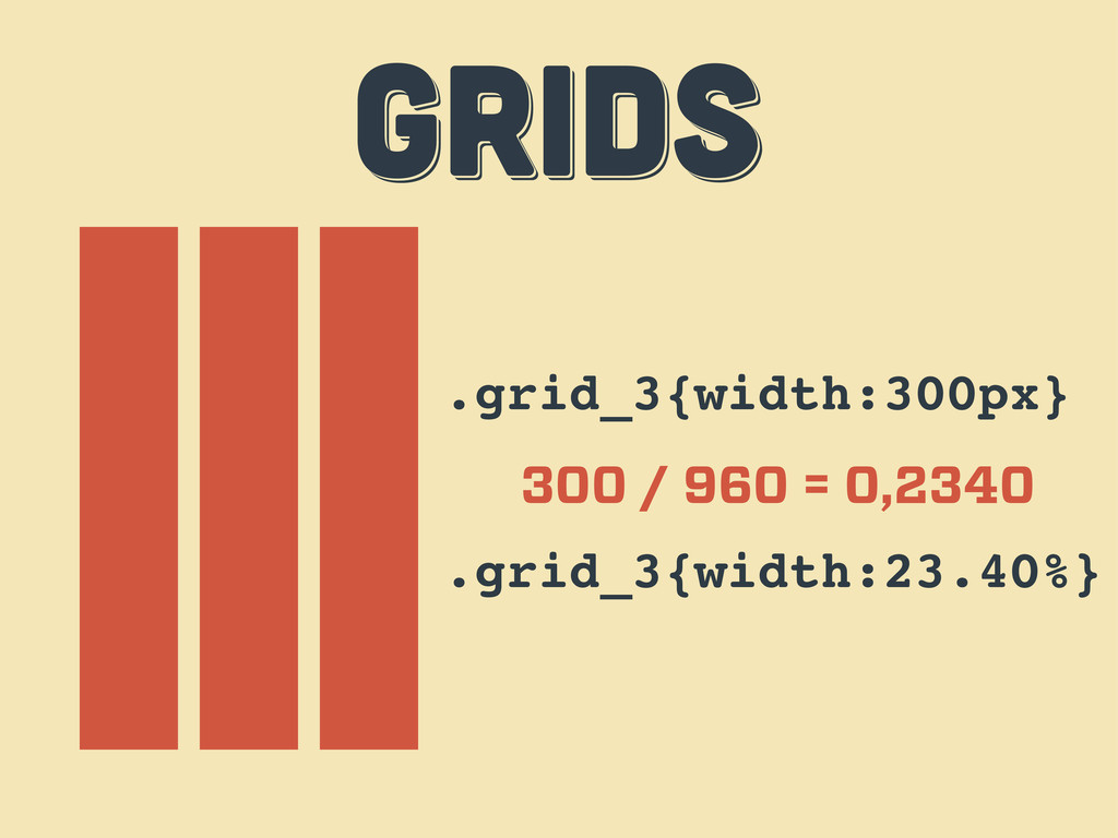
.grid_3{width:300px} 300 / 960 = 0,2340 .grid_3{width:23.40%} GRIDS GRIDS GRIDS
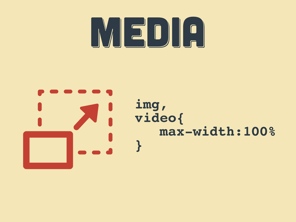
MEDIA MEDIA MEDIA img, video{ max-width:100% }
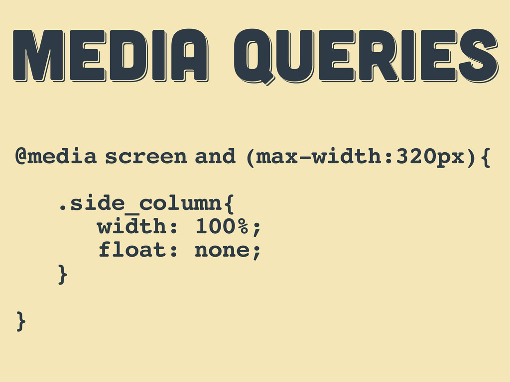
MEDIA QUERIES MEDIA QUERIES MEDIA QUERIES @media screen and (max-width:320px){
.side_column{ width: 100%; float: none; } }
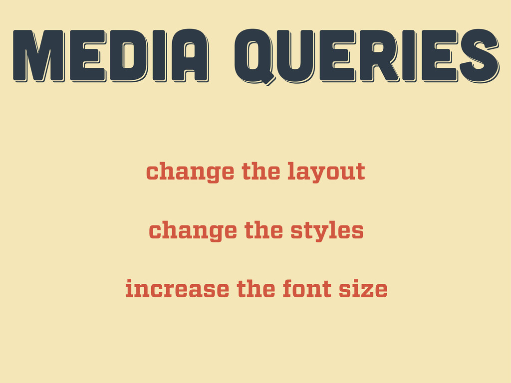
MEDIA QUERIES MEDIA QUERIES MEDIA QUERIES change the layout change
the styles increase the font size
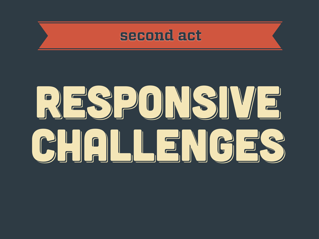
RESPoNSIVE challenges RESPoNSIVE challenges Responsive challenges second act
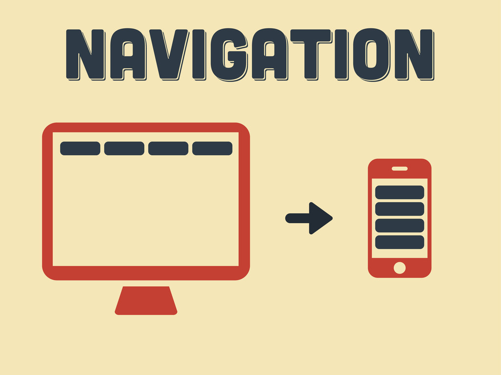
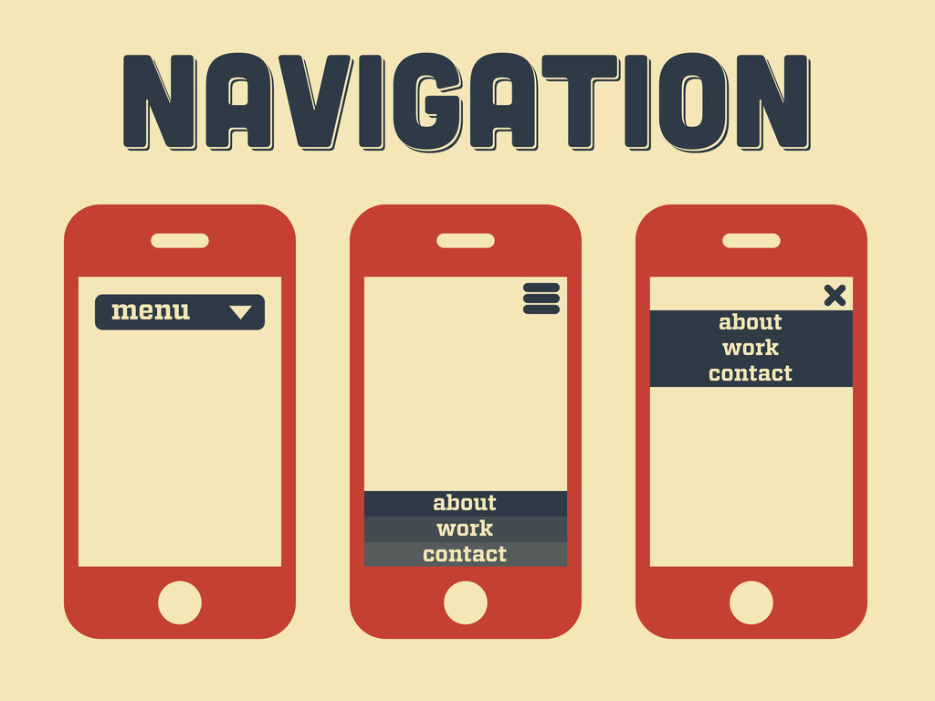
Navigation Navigation Navigation
Navigation Navigation Navigation menu contact work about contact work about
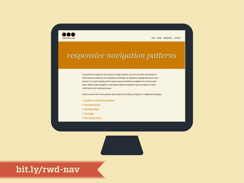
bit.ly/rwd-nav
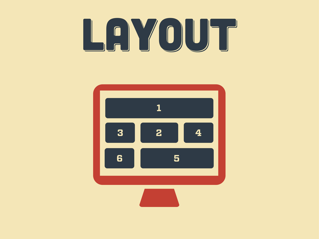
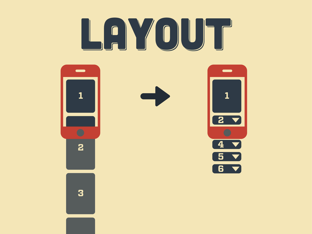
LAYOUT LAYOUT layout 1 2 3 4 6 5
3 2 LAYOUT LAYOUT layout 1 3 1 2 4
5 6
LAYOUT LAYOUT layout
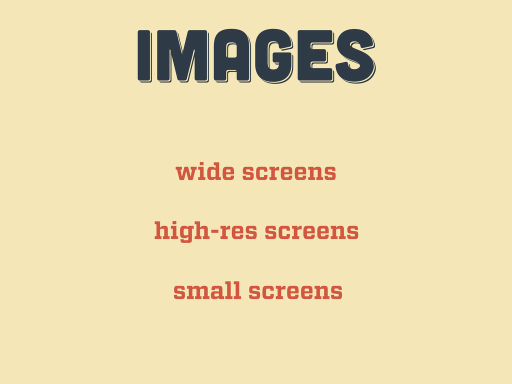
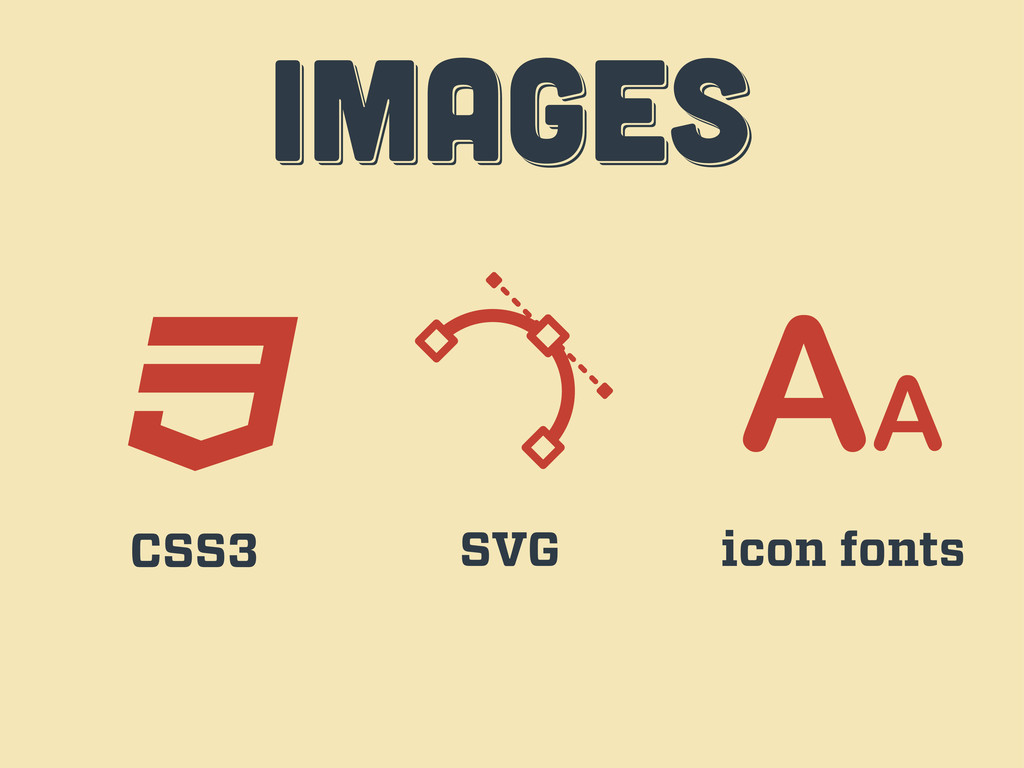
IMAGES IMAGES images wide screens high-res screens small screens
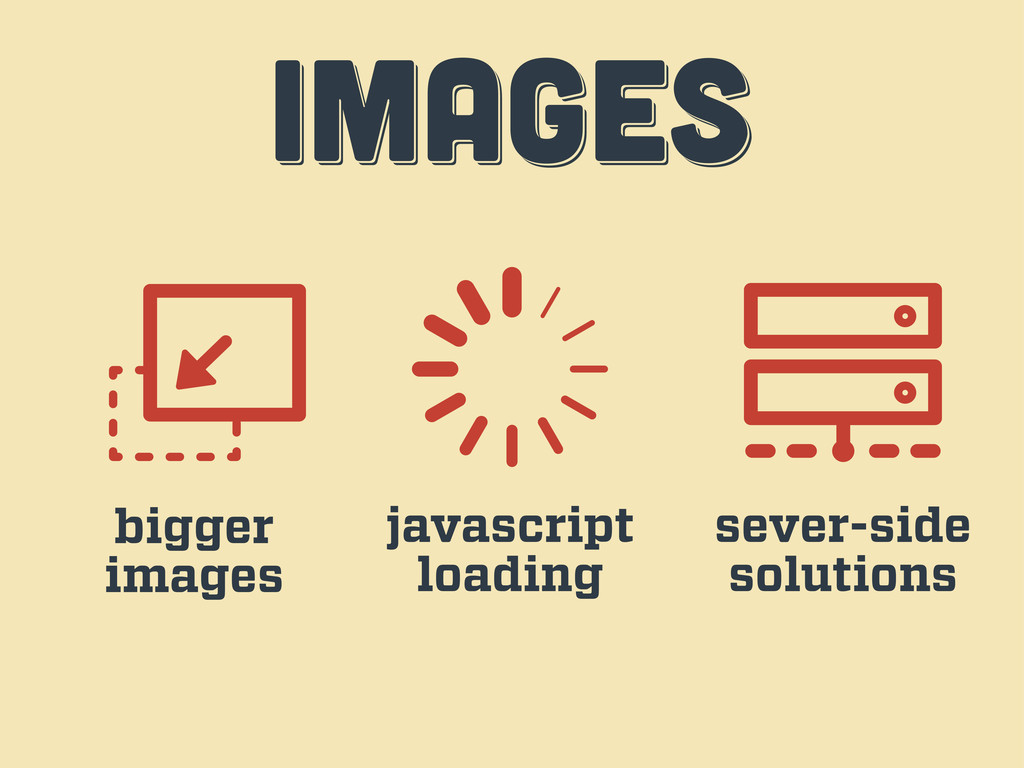
IMAGES IMAGES images bigger images javascript loading sever-side solutions
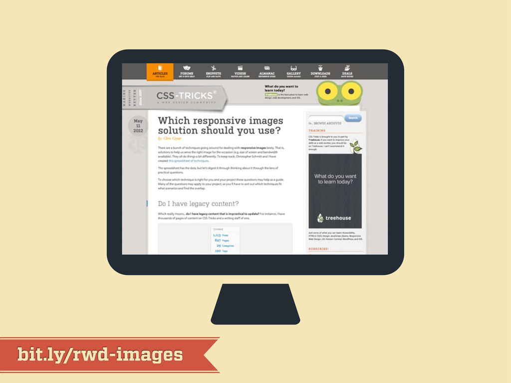
bit.ly/rwd-images
IMAGES IMAGES images CSS3 SVG icon fonts
workflow workflow workflow third act
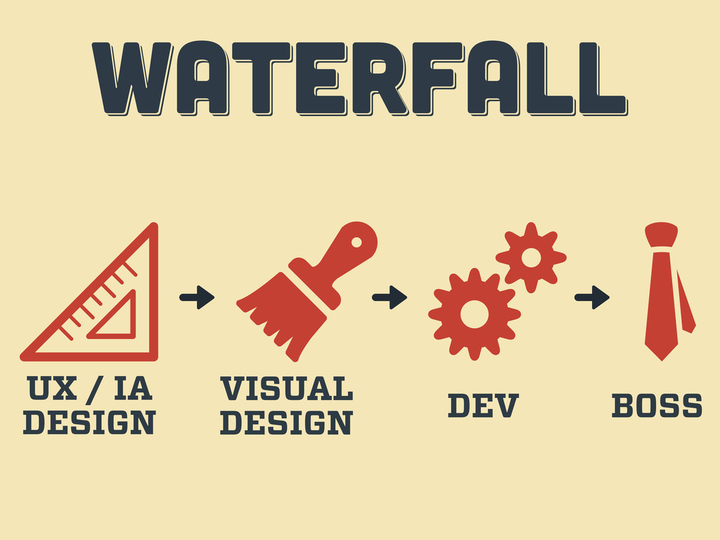
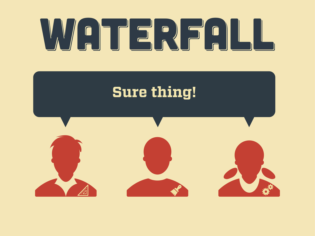
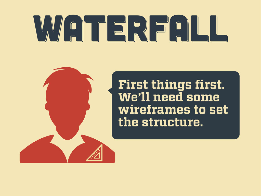
WATERFALL WATERFALL WATERFALL UX / IA DESIGN VISUAL DESIGN DEV
BOSS
Hi, I want a website… WATERFALL WATERFALL WATERFALL
Sure thing! WATERFALL WATERFALL WATERFALL
First things first. We’ll need some wireframes to set the
structure. WATERFALL WATERFALL WATERFALL
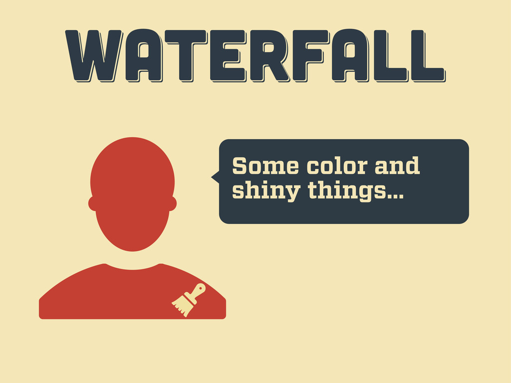
Some color and shiny things… WATERFALL WATERFALL WATERFALL
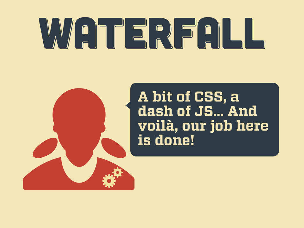
A bit of CSS, a dash of JS... And voilà,
our job here is done! WATERFALL WATERFALL WATERFALL
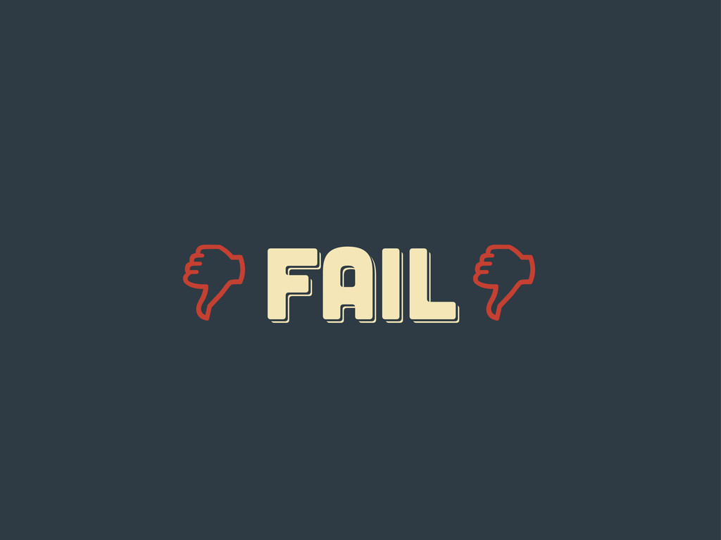
Er... guys... WATERFALL WATERFALL WATERFALL
FAIL fail Fail
responsive responsive Responsive
ten tips ten tips ten tips fourth act
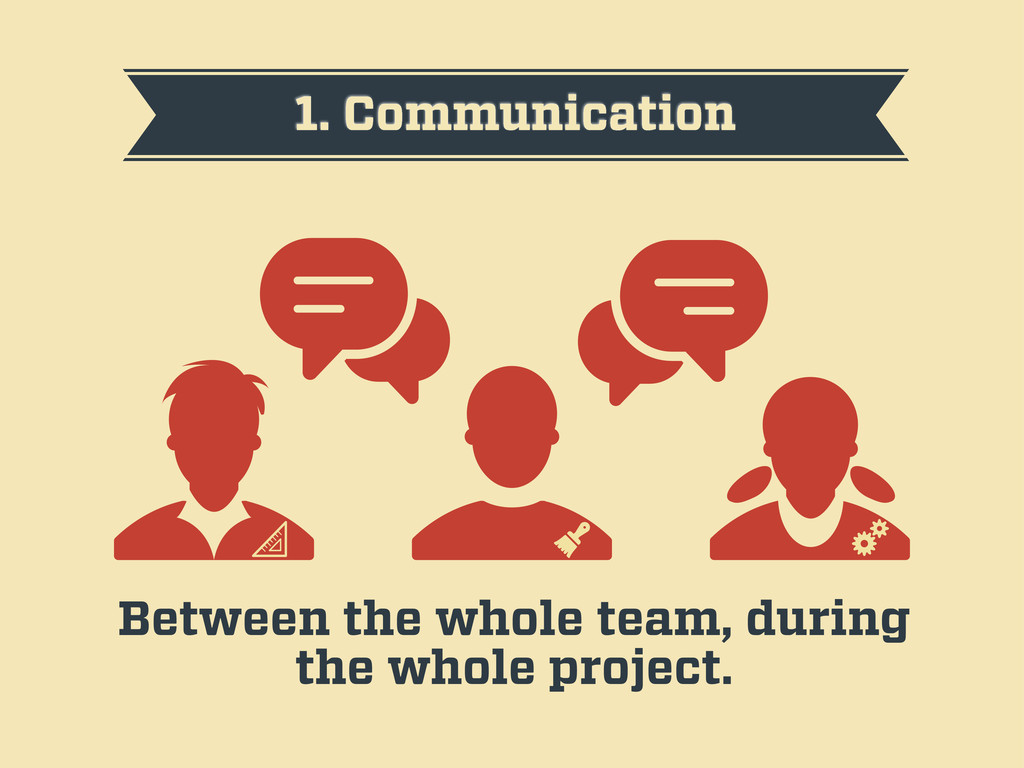
1. Communication Between the whole team, during the whole project.
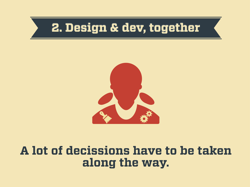
2. Design & dev, together A lot of decissions have
to be taken along the way.
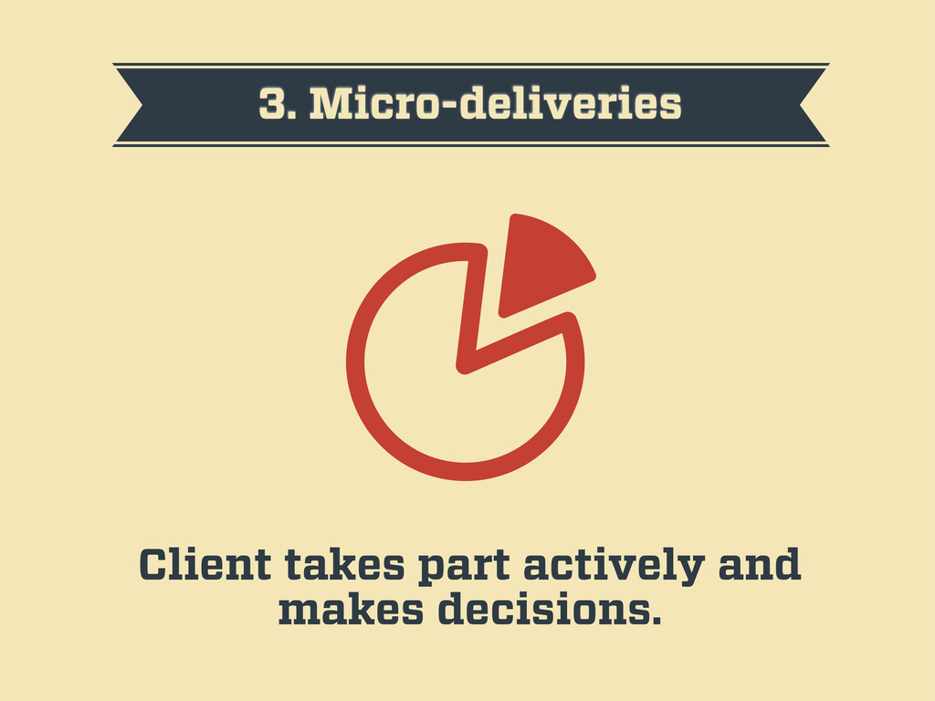
3. Micro-deliveries Client takes part actively and makes decisions.
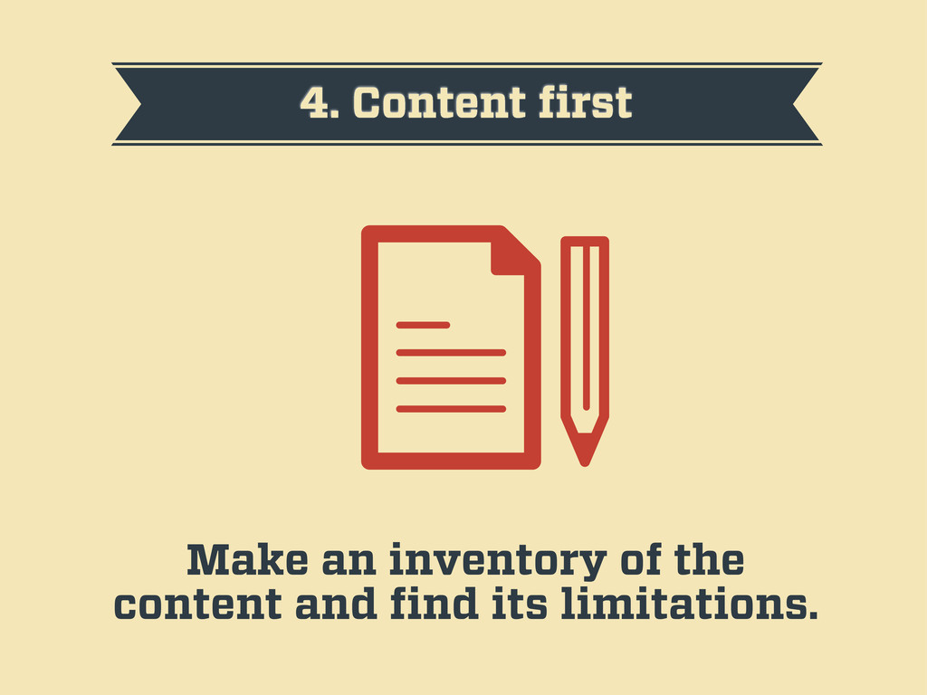
4. Content first Make an inventory of the content and
find its limitations.
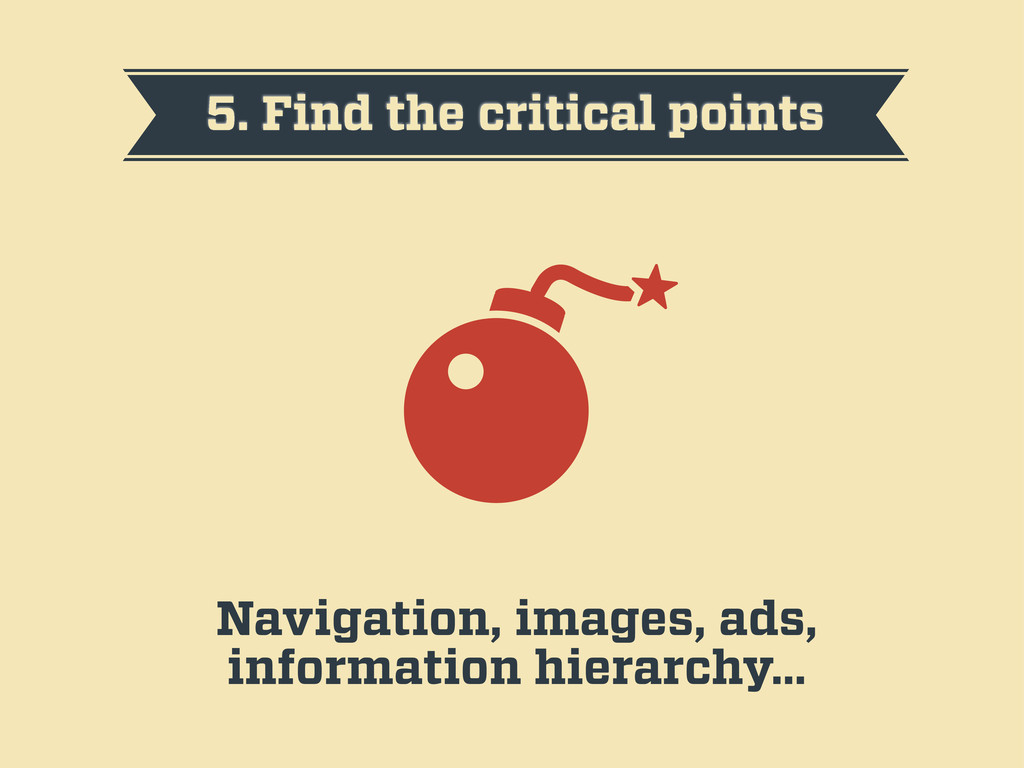
5. Find the critical points Navigation, images, ads, information hierarchy…
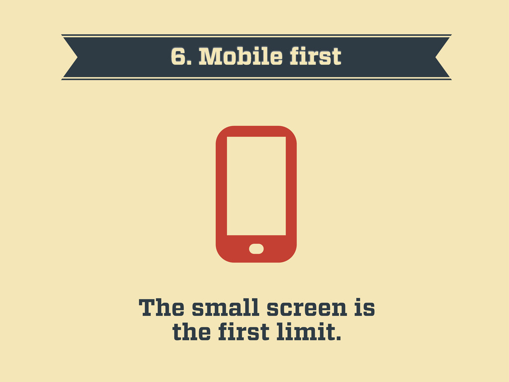
6. Mobile first The small screen is the first limit.
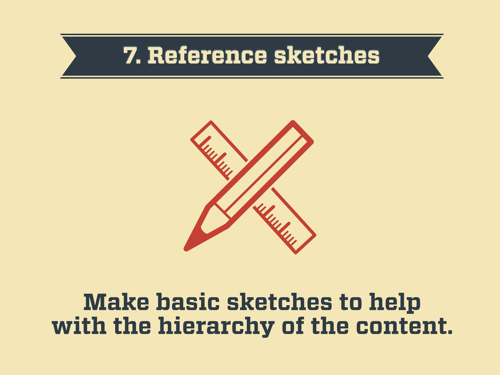
7. Reference sketches Make basic sketches to help with the
hierarchy of the content.
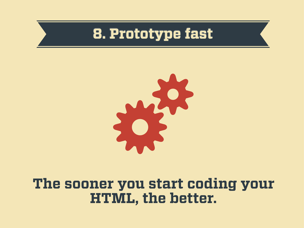
8. Prototype fast The sooner you start coding your HTML,
the better.
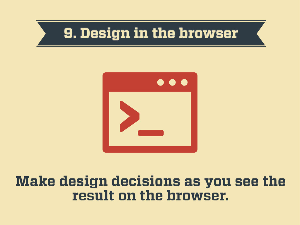
9. Design in the browser Make design decisions as you
see the result on the browser.
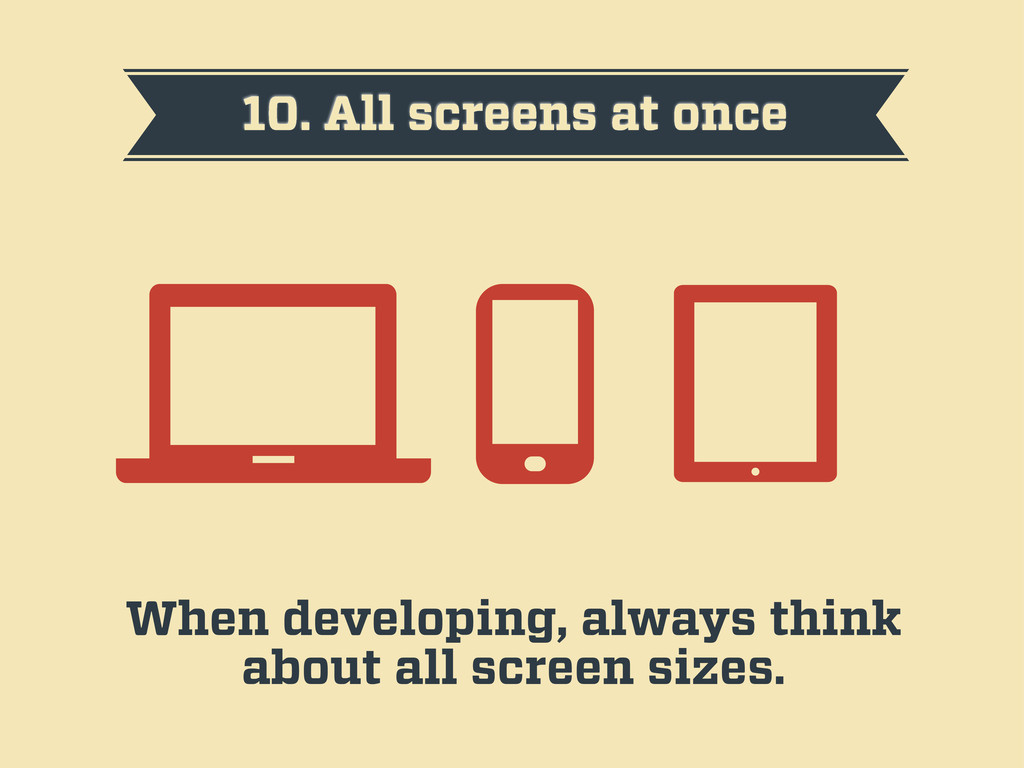
10. All screens at once When developing, always think about
all screen sizes.
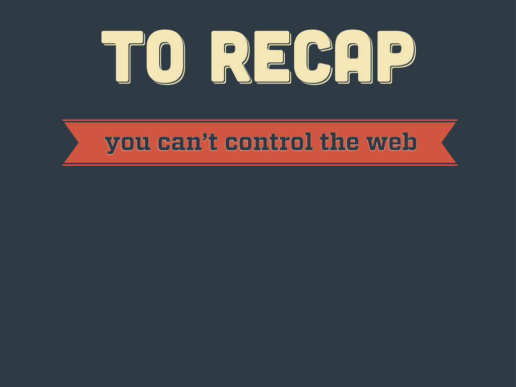
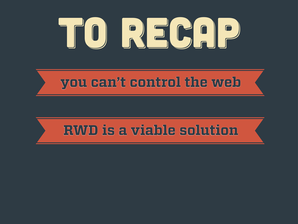
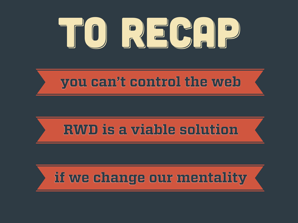
TO RECAP TO RECAP TO RECAP
TO RECAP TO RECAP TO RECAP you can’t control the
web
TO RECAP TO RECAP TO RECAP you can’t control the
web RWD is a viable solution
TO RECAP TO RECAP TO RECAP you can’t control the
web RWD is a viable solution if we change our mentality
thanks! thanks! thanks! Javier Usobiaga · http://Swwweet.com · @htmlboy
 swwweet
 shoheimitani
 yakumo
 keiichiito1978
 zozotech
 andrzejkrzywda
 shibayu36
 sansan33
 tsukuboshi
 okdt
okdt
 khmoryz
 schroneko
 signer
 cassininazir
 rkendrick25
 mfonobong
 aleyda
 jacobian
 maltzj
 madoxten
 erikaheidi
 honzajavorek
 wayneb77