Upgrade to Pro
— share decks privately, control downloads, hide ads and more …
Speaker Deck
Features
Speaker Deck
PRO
Sign in
Sign up for free
Search
Search
SpeakGood_Workshop-Session_3.pdf
Search
Craig Berntson
August 02, 2018
0
57
SpeakGood_Workshop-Session_3.pdf
Part 3 of my How to Speak Good Workshop. This session discusses proper use of PowerPoint
Craig Berntson
August 02, 2018
Tweet
Share
More Decks by Craig Berntson
See All by Craig Berntson
Improving Microservice Performance with gRPC
craigber
0
47
Clear_Architecture-16x9-V1.pdf
craigber
1
140
Brownfield Development Strategies
craigber
0
100
SpeakGood_Workshop-Session_2.pdf
craigber
0
51
Speak Good Workshop 1
craigber
0
48
Software Gardening
craigber
0
74
Lean DevOps
craigber
1
240
Code Reviews: The #1 Way to Improve Code Quality
craigber
1
250
ASP.NET Core 1.0
craigber
0
88
Featured
See All Featured
Collaborative Software Design: How to facilitate domain modelling decisions
baasie
0
140
Visualization
eitanlees
150
17k
Pawsitive SEO: Lessons from My Dog (and Many Mistakes) on Thriving as a Consultant in the Age of AI
davidcarrasco
0
67
Java REST API Framework Comparison - PWX 2021
mraible
34
9.1k
Leveraging Curiosity to Care for An Aging Population
cassininazir
1
160
技術選定の審美眼(2025年版) / Understanding the Spiral of Technologies 2025 edition
twada
PRO
117
110k
ラッコキーワード サービス紹介資料
rakko
1
2.3M
コードの90%をAIが書く世界で何が待っているのか / What awaits us in a world where 90% of the code is written by AI
rkaga
60
42k
A better future with KSS
kneath
240
18k
Getting science done with accelerated Python computing platforms
jacobtomlinson
2
120
From Legacy to Launchpad: Building Startup-Ready Communities
dugsong
0
140
Rails Girls Zürich Keynote
gr2m
96
14k
Transcript
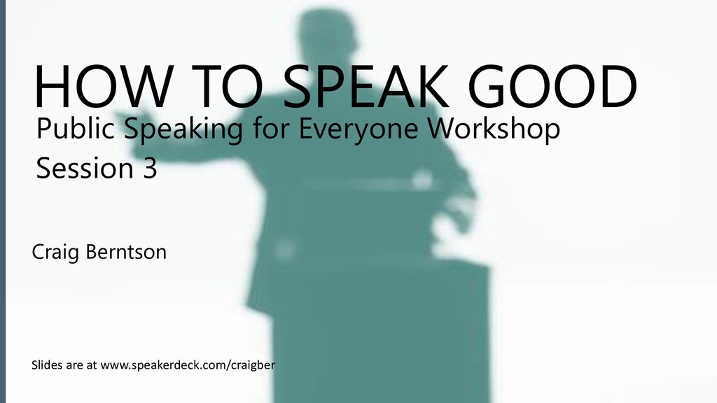
HOW TO SPEAK GOOD Craig Berntson Public Speaking for Everyone
Workshop Session 3 Slides are at www.speakerdeck.com/craigber
1 Anxiety 2 Preparing in Analog 3 PowerPoint 4 Rehearsal
& Showtime 5 Presentations 6 Presentations & Wrap-up
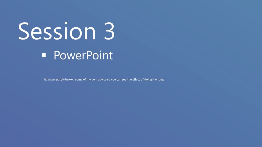
Session 3 ▪ PowerPoint I have purposely broken some of
my own advice so you can see the effect of doing it wrong.
None
None
None
None
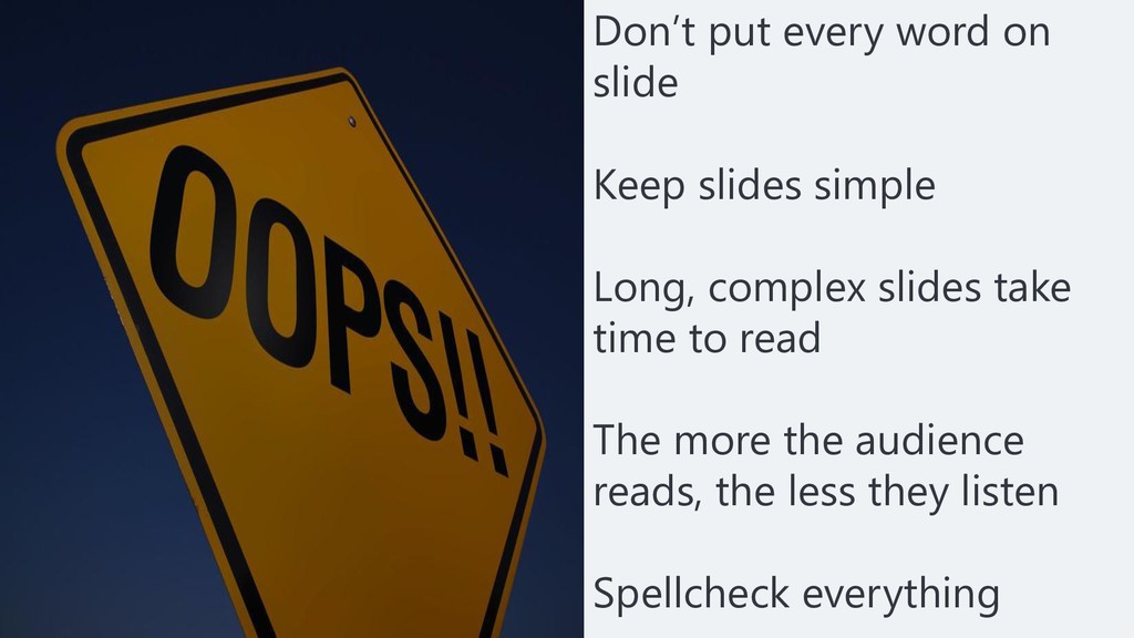
Don’t put every word on slide Keep slides simple Long,
complex slides take time to read The more the audience reads, the less they listen Spellcheck everything
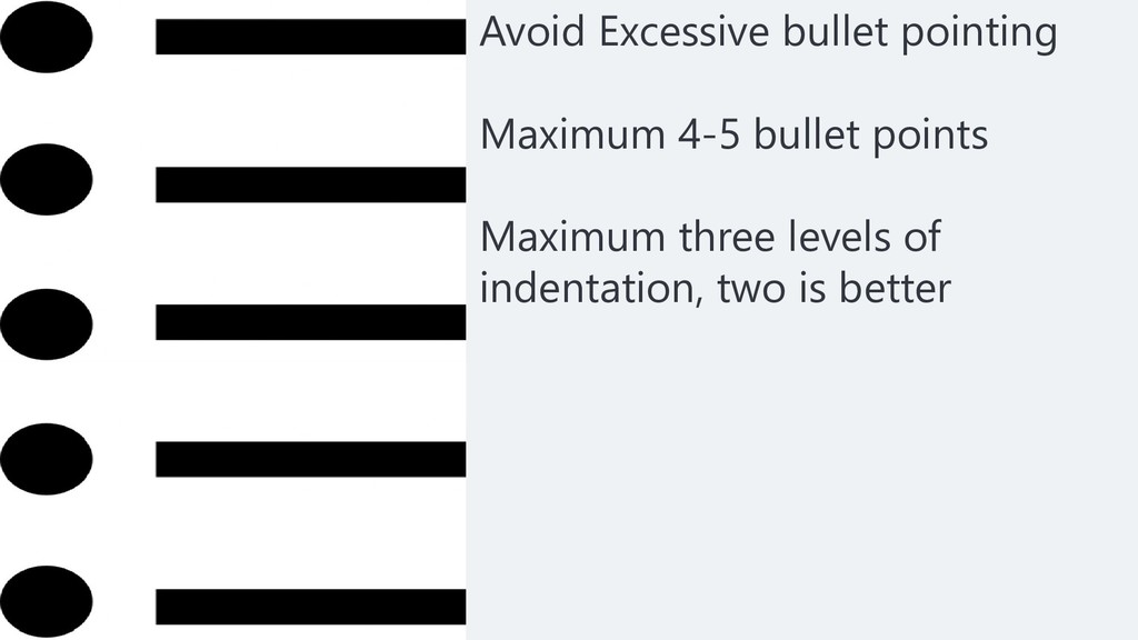
Avoid Excessive bullet pointing Maximum 4-5 bullet points Maximum three
levels of indentation, two is better
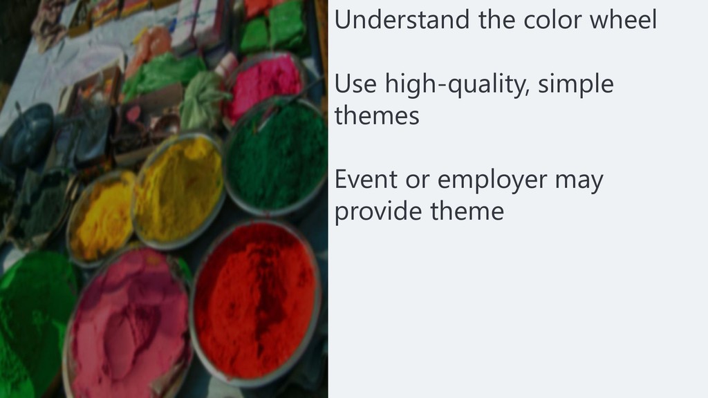
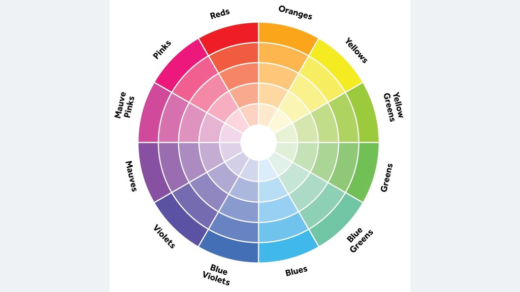
Understand the color wheel Use high-quality, simple themes Event or
employer may provide theme
None
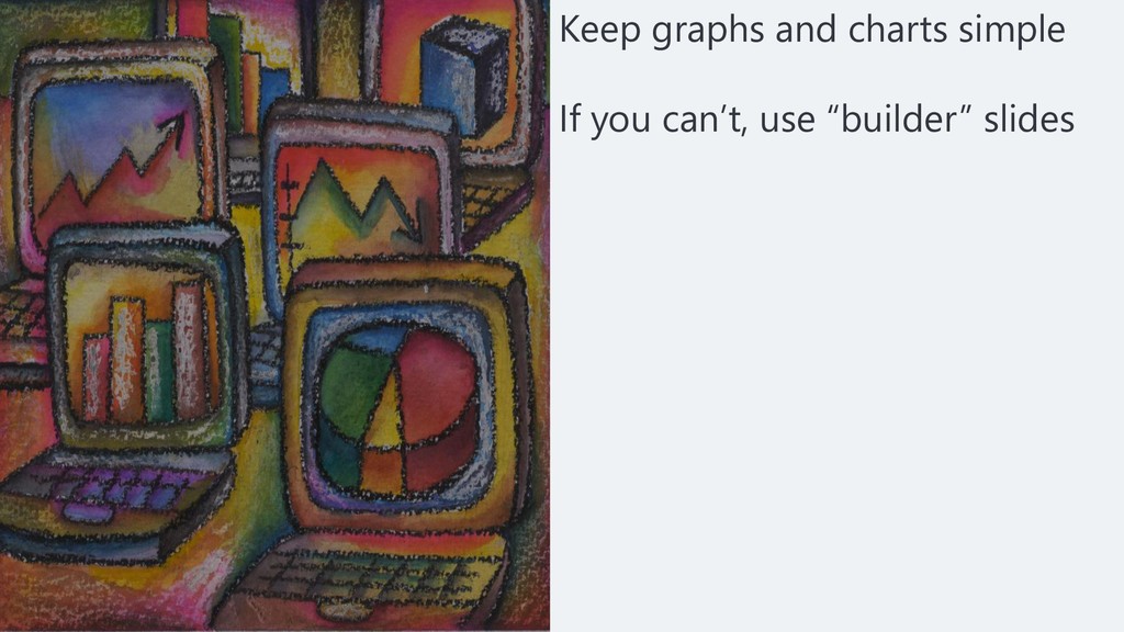
Keep graphs and charts simple If you can’t, use “builder”
slides
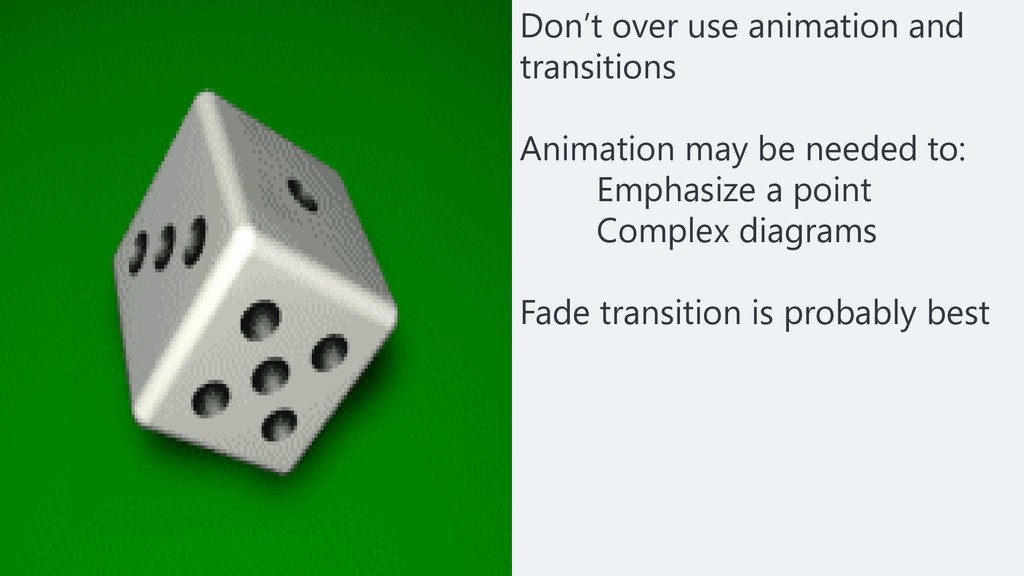
Don’t over use animation and transitions Animation may be needed
to: Emphasize a point Complex diagrams Fade transition is probably best
No smaller than 24 point font Clean, easy to read
fonts Use sans-serif rather than serif font Font color should contrast with background
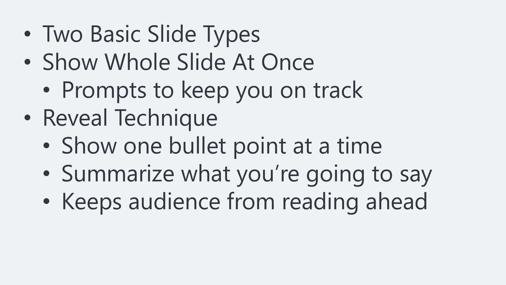
• Two Basic Slide Types • Show Whole Slide At
Once • Prompts to keep you on track • Reveal Technique • Show one bullet point at a time • Summarize what you’re going to say • Keeps audience from reading ahead
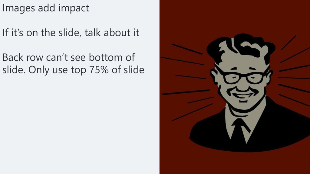
Images add impact If it’s on the slide, talk about
it Back row can’t see bottom of slide. Only use top 75% of slide
Give your slides the billboard test
None
None
None
None
None
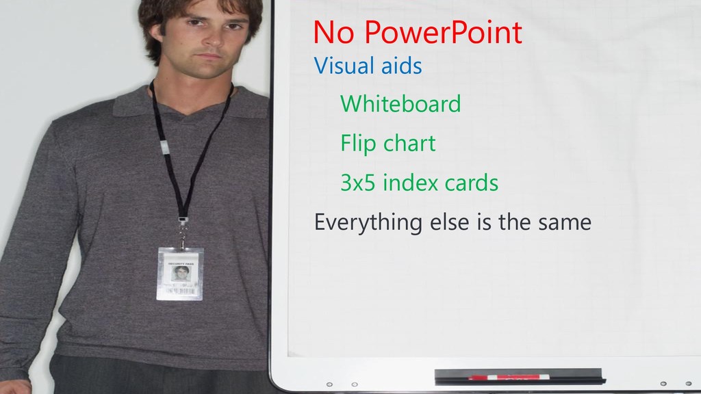
No PowerPoint Visual aids Whiteboard Flip chart 3x5 index cards
Everything else is the same
Demo
No PowerPoint Bullet Points Graphs and Charts Transitions and Animations
Fonts, Color, Images How not to use PowerPoint
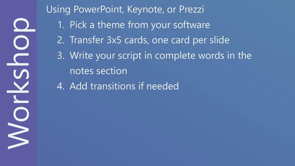
Workshop Using PowerPoint, Keynote, or Prezzi 1. Pick a theme
from your software 2. Transfer 3x5 cards, one card per slide 3. Write your script in complete words in the notes section 4. Add transitions if needed
None