Upgrade to Pro — share decks privately, control downloads, hide ads and more …

Planting the responsive seed

Planting the responsive seed

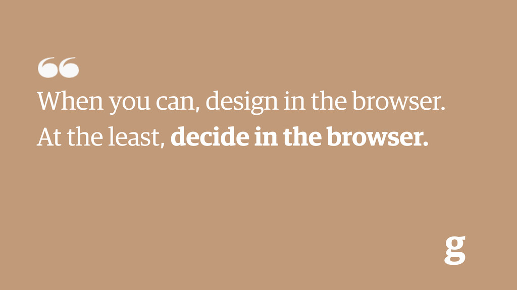
The Guardian recently released a new mobile site on m.guardian.co.uk, but in fact it is the planting of a seed of a more ambitious project to replace the desktop website with a future-friendly, single domain responsive product. We will learn how we are using mobile-first responsive techniques and client-side technology to set the foundations of that future, what have we learnt along the way and how it will scale.

Patrick Hamann

June 26, 2013
Tweet

More Decks by Patrick Hamann

Other Decks in Programming

Transcript

  1. What I’m going to cover today • Why we needed

    to go responsive • How we are doing it • What we have learnt along the way • Questions g
  2. Latest news, sport and comment from the Guardian | The

    Guardian Search http://www.guardian.co.uk g
  3. 15-30% of the Guardian traffic is mobile g Tablet 11%

    Mobile 21% Dektop 68% Dektop Mobile Tablet
  4. g Creating a separate mobile experience can actually be a

    blessing in disguise. It gives you time to re-evaluate, prioritize, strip down and focus on what’s really important. [...] this process eventually changes the way you think about your content, infrastructure, user experience and approach. Brad Frost Planting the seed for a responsive future - 2012 http://bradfrostweb.com/blog/mobile/planting-the-seed-for-a-responsive-future/
  5. Benefits of Planting the seed g • Start with a

    clean slate • Content strategy • Mobile first • Future-friendly platform • Buy one get 4 free!
  6. How are we doing it? g • Build upon open

    software and API’s • Progressive enhancement • Detect features not devices • Modular decoupled systems • Performance by design • Build upon open software and API’s • Progressive enhancement • Detect features not devices • Modular decoupled systems • Performance by design
  7. Some tech g Scala Play! RequireJS Sass AWS PhantomJS Selenium

    localStorage CORS Grunt NodeJS Web Fonts Bower Jasmine
  8. How are we doing it? g • Build upon open

    software and API’s • Progressive enhancement • Detect features not devices • Modular decoupled systems • Performance by design
  9. g As a web developer “cutting the mustard” provides me

    with an opportunity to wipe the client-side development slate clean and start afresh.. [...] The increasing popularity of mobile web browsing, and the availability of responsive web design has forced my team to refactor how we think a modern webpage should be built. Tom Maslen BBC News - 2012 http://responsivenews.co.uk/post/18948466399/cutting-the-mustard
  10. How are we doing it? g • Build upon open

    software and API’s • Progressive enhancement • Detect features not devices • Modular decoupled systems • Performance by design
  11. Web fonts g • Detect support • Fetch async •

    Base64 encoded • Batch all fonts as strings in one request • Cache in localStorage • Reduces HTTP requests • Mobile HTTP cache is unreliable
  12. Responsive images g • Assume everyone is on a low

    connection • Remove from DOM • Detect connection • Assuming connection may be bad... • Demand load based on features
  13. How are we doing it? g • Build upon open

    software and API’s • Progressive enhancement • Detect features not devices • Modular decoupled systems • Performance by design
  14. Swimlaning g • Each section of the website is its

    own application and server • (fronts, articles, video, galleries, tag e.t.c) • Deploy individually • If one application fails, the rest continue unharmed • Enforce one blocking request for “core content” per page
  15. How are we doing it? g • Build upon open

    software and API’s • Progressive enhancement • Detect features not devices • Modular decoupled systems • Performance by design
  16. Performance first g • Compress everything, even HTML (whitespace &

    gzip) • Caching • Far -future headers, max-age, invalidation • Latency is a big problem on mobile • CDN’s are one solution to this • Load only bare minimum (Images, CSS & JS) • R.U.M
  17. g When you can, design in the browser. At the

    least, decide in the browser.
  18. g Testing is hard. • It is impossible to test

    on every device • Build up small core library (Android 2.3, iOS 4, Blackberry 9) • Focus on browsers
  19. g Every new feature must be justified. • Optimize an

    existing feature • Remove an existing feature • Don’t add the new feature