Upgrade to Pro
— share decks privately, control downloads, hide ads and more …
Speaker Deck
Features
Speaker Deck
PRO
Sign in
Sign up for free
Search
Search
Responsive Design
Search
Sponsored
·
Ship Features Fearlessly
Turn features on and off without deploys. Used by thousands of Ruby developers.
→
Andy Hume
November 13, 2011
Technology
23
1.4k
Responsive Design
Practical approaches to building responsive websites
Andy Hume
November 13, 2011
Tweet
Share
More Decks by Andy Hume
See All by Andy Hume
Architecting resilient front-ends, jQuery UK, 2015
andyhume
2
1.2k
Building for performance and resilience
andyhume
5
1.2k
Architecting resilient front ends
andyhume
3
900
Guardian Responsive Design, SmashingConf 2013
andyhume
6
690
Web Fonts as a Progressive Enhancement, Ampersand 2013
andyhume
2
810
Anatomy of a responsive page load, WhiskyWeb 2013
andyhume
10
1.9k
Breaking News & Breaking Software, SyncConf 2013
andyhume
0
320
Anatomy of a responsive page load, Responsive Day Out 2013
andyhume
23
3.3k
Responsive Guardian
andyhume
21
1.2k
Other Decks in Technology
See All in Technology
Frontier Agents (Kiro autonomous agent / AWS Security Agent / AWS DevOps Agent) の紹介
msysh
3
180
モダンUIでフルサーバーレスなAIエージェントをAmplifyとCDKでサクッとデプロイしよう
minorun365
4
220
Oracle Base Database Service 技術詳細
oracle4engineer
PRO
15
93k
プロダクト成長を支える開発基盤とスケールに伴う課題
yuu26
4
1.4k
1,000 にも届く AWS Organizations 組織のポリシー運用をちゃんとしたい、という話
kazzpapa3
0
150
Why Organizations Fail: ノーベル経済学賞「国家はなぜ衰退するのか」から考えるアジャイル組織論
kawaguti
PRO
1
180
[CV勉強会@関東 World Model 読み会] Orbis: Overcoming Challenges of Long-Horizon Prediction in Driving World Models (Mousakhan+, NeurIPS 2025)
abemii
0
150
小さく始めるBCP ― 多プロダクト環境で始める最初の一歩
kekke_n
1
570
CDK対応したAWS DevOps Agentを試そう_20260201
masakiokuda
1
400
SchooでVue.js/Nuxtを技術選定している理由
yamanoku
3
200
仕様書駆動AI開発の実践: Issue→Skill→PRテンプレで 再現性を作る
knishioka
2
680
フルカイテン株式会社 エンジニア向け採用資料
fullkaiten
0
10k
Featured
See All Featured
Leadership Guide Workshop - DevTernity 2021
reverentgeek
1
200
GraphQLとの向き合い方2022年版
quramy
50
14k
Abbi's Birthday
coloredviolet
1
4.8k
Claude Code のすすめ
schroneko
67
210k
Navigating Algorithm Shifts & AI Overviews - #SMXNext
aleyda
0
1.1k
Into the Great Unknown - MozCon
thekraken
40
2.3k
The SEO Collaboration Effect
kristinabergwall1
0
350
[RailsConf 2023] Rails as a piece of cake
palkan
59
6.3k
Automating Front-end Workflow
addyosmani
1371
200k
Git: the NoSQL Database
bkeepers
PRO
432
66k
Design in an AI World
tapps
0
150
Visual Storytelling: How to be a Superhuman Communicator
reverentgeek
2
430
Transcript
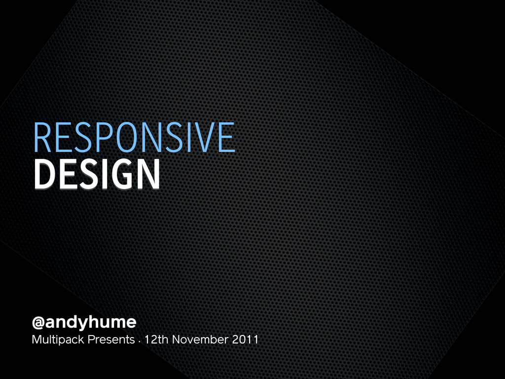
@andyhume Multipack Presents • 12th November 2011 DESIGN RESPONSIVE
@andyhume Multipack Presents • 12th November 2011 DESIGN RESPONSIVE
None
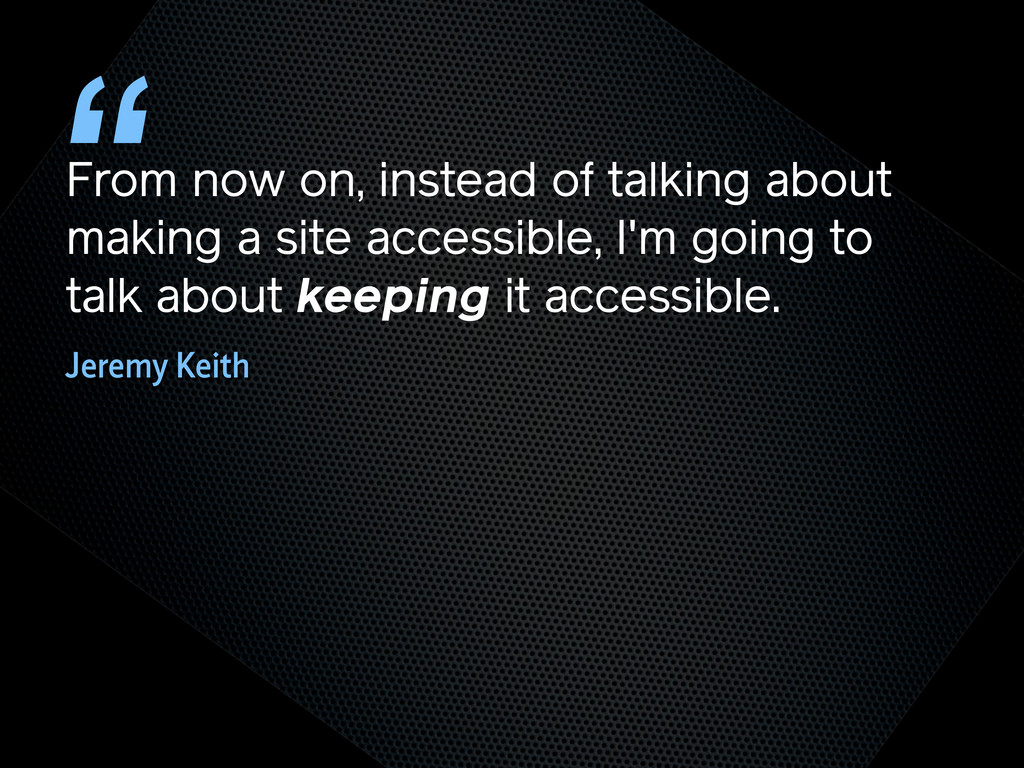
From now on, instead of talking about making a site
accessible, I'm going to talk about keeping it accessible. “ Jeremy Keith
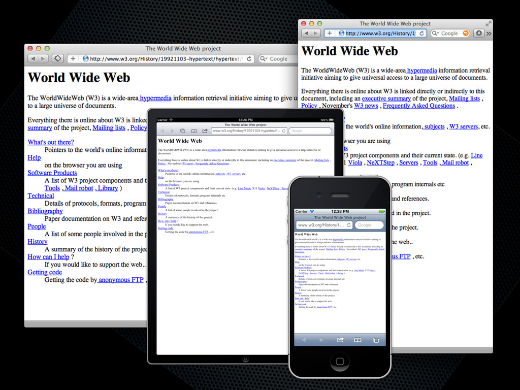
TRY NOT TO BREAK IT? THE WEB WORKS
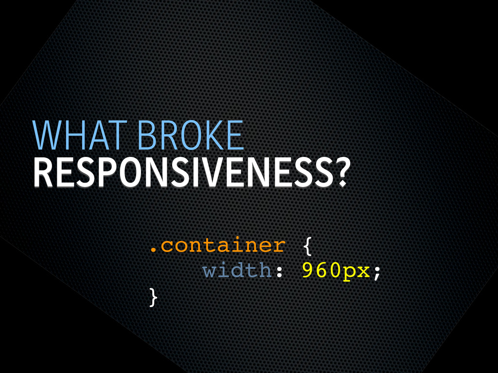
RESPONSIVENESS? WHAT BROKE .container { width: 960px; }
SEMANTIC HTML STEPS[0]
OOCSS STEPS[1] Loosely couple content styling from layout styling <link
rel="stylesheet" href="core.css">
CORE.CSS STEPS[4] .product .title { font-size: 1em; } @media screen
and (min-width: 60em) { .product .title { font-size: 1.4em; } } Keep modules together
SELECTOR QUERIES? STEPS[4] <div class="product" data-squery="min-width: 400px=wide max-width:10em=small"> <p>Content here</p>
</div> Adapt content based on container width https://github.com/ahume/selector-queries
SELECTOR QUERIES? STEPS[4] .product img { max-width: 100%; } .product.wide
img { // greater than 400px float: left; margin-right: 1em; max-width: auto; } Adapt content based on container width https://github.com/ahume/selector-queries
NAVIGATION STEPS[2]
NAVIGATION STEPS[2]
ADDING LAYOUT STEPS[3] <link rel="stylesheet" href="core.css"> <link rel="stylesheet" href="layout.css" media="screen
and (min-width:40em)"> Loosely couple content styling from layout styling
IE <9 STEPS[5] Send full ‘desktop’ layout <link rel="stylesheet" href="core.css">
<link rel="stylesheet" href="layout.css" media="screen and (min-width:40em)"> <!--[if lt IE 9]> <link rel="stylesheet" href="layout.css" media="screen"> <![endif]-->
IE <9 STEPS[5] Send full ‘desktop’ layout - but not
to mobile <link rel="stylesheet" href="core.css"> <link rel="stylesheet" href="layout.css" media="screen and (min-width:40em)"> <!--[if lt IE 9] & !(IEMobile)]> <link rel="stylesheet" href="layout.css" media="screen"> <![endif]-->
IE <9 STEPS[5] Send full ‘desktop’ layout - or not
<link rel="stylesheet" href="core.css"> <link rel="stylesheet" href="layout.css" media="screen and (min-width:40em)"> <!--[if lt IE 9] & !(IEMobile) & (gt IE6)]> <link rel="stylesheet" href="layout.css" media="screen"> <![endif]-->
IE <9 STEPS[5] Polyfill media queries <script rel="respond.js"></script> https://github.com/scottjehl/Respond
VIEWPORT STEPS[6] Set layout viewport width to the device width
<meta name="viewport" content="width=device-width, initial-scale=1.0">
VIEWPORT STEPS[6] W3C Syntax: coming soon http://dev.w3.org/csswg/css-device-adapt/ @viewport { width:
device-width; zoom: 1.0; }
IMAGES STEPS[7] Shrinking img { max-width: 100%; }
RESPONSIVE IMAGES STEPS[7] Small image by default Don’t download both
RESPONSIVE IMAGES STEPS[7] Client-side solutions https://github.com/filamentgroup/Responsive-Images https://github.com/ahume/Responsive-Images https://github.com/allmarkedup/responsive-images-alt
RESPONSIVE IMAGES STEPS[7] Here and now? src.sencha.io <img src="http://src.sencha.io/http://andyhume.net/ u.jpg">
RESPONSIVE IMAGES STEPS[7] Here and now? Image replacement <div class="logo">
<img src="logo.png" alt="Company name"> </div> .logo { background-image: url(logo-large.png); } .logo img { position: absolute; left: -9999px; }
SVG STEPS[8] Same approaches to support as responsive images
ENHANCING CONTENT STEPS[9] What’s core content?
ENHANCING CONTENT STEPS[9]
ENHANCING CONTENT STEPS[9]
ENHANCING CONTENT STEPS[9] if ($(document).width() > 640) { ! $.get('path/to/html',
function(data) { ! ! $('[role="complementary"]').append(data); ! }); } What’s core content?
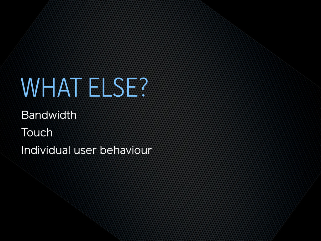
WHAT ELSE? Bandwidth Touch Individual user behaviour
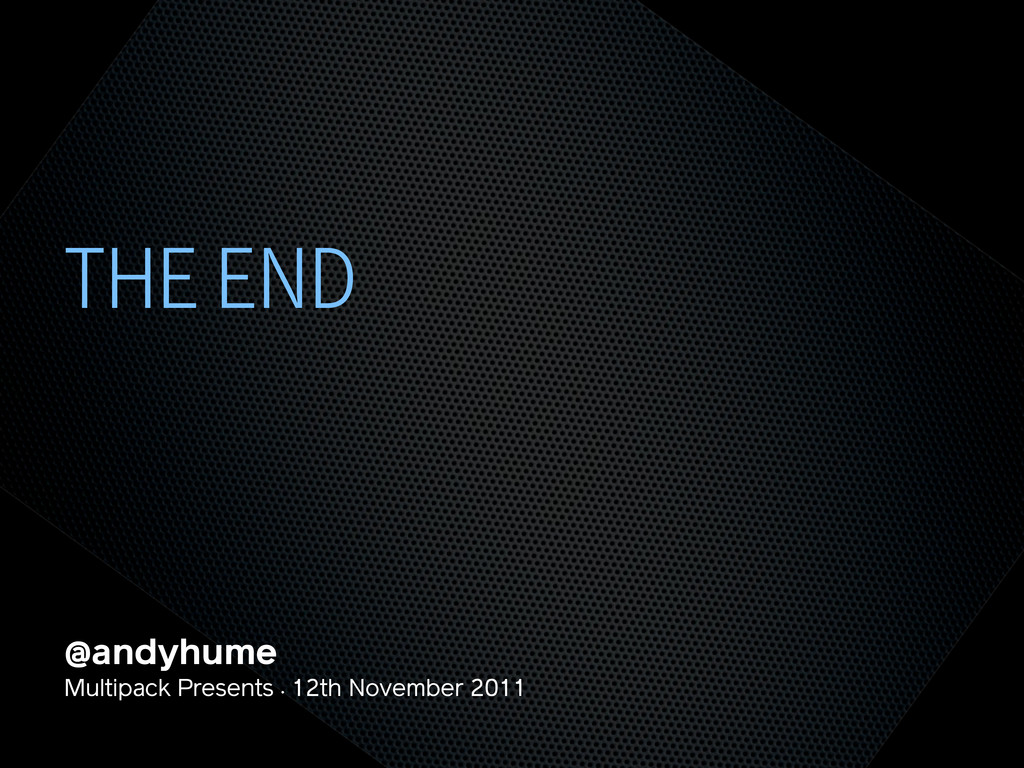
THE END @andyhume Multipack Presents • 12th November 2011
 andyhume
 msysh
msysh
 minorun365
 oracle4engineer
 yuu26
yuu26
 kazzpapa3
 kawaguti
 abemii
 kekke_n
 masakiokuda
 yamanoku
 knishioka
 fullkaiten
 reverentgeek
 quramy
 coloredviolet
 schroneko
 aleyda
 thekraken
 kristinabergwall1
 palkan
 addyosmani
 bkeepers
 tapps
tapps
![SEMANTIC HTML STEPS[0]](https://files.speakerdeck.com/presentations/4ec011cd70a8050051006edf/slide_6.jpg)
![OOCSS STEPS[1] Loosely couple content styling from layout styling <link](https://files.speakerdeck.com/presentations/4ec011cd70a8050051006edf/slide_7.jpg)
![CORE.CSS STEPS[4] .product .title { font-size: 1em; } @media screen](https://files.speakerdeck.com/presentations/4ec011cd70a8050051006edf/slide_8.jpg)
![SELECTOR QUERIES? STEPS[4] <div class="product" data-squery="min-width: 400px=wide max-width:10em=small"> <p>Content here</p>](https://files.speakerdeck.com/presentations/4ec011cd70a8050051006edf/slide_9.jpg)
![SELECTOR QUERIES? STEPS[4] .product img { max-width: 100%; } .product.wide](https://files.speakerdeck.com/presentations/4ec011cd70a8050051006edf/slide_10.jpg)
![NAVIGATION STEPS[2]](https://files.speakerdeck.com/presentations/4ec011cd70a8050051006edf/slide_11.jpg)
![NAVIGATION STEPS[2]](https://files.speakerdeck.com/presentations/4ec011cd70a8050051006edf/slide_12.jpg)
![ADDING LAYOUT STEPS[3] <link rel="stylesheet" href="core.css"> <link rel="stylesheet" href="layout.css" media="screen](https://files.speakerdeck.com/presentations/4ec011cd70a8050051006edf/slide_13.jpg)
![IE <9 STEPS[5] Send full ‘desktop’ layout <link rel="stylesheet" href="core.css">](https://files.speakerdeck.com/presentations/4ec011cd70a8050051006edf/slide_14.jpg)
![IE <9 STEPS[5] Send full ‘desktop’ layout - but not](https://files.speakerdeck.com/presentations/4ec011cd70a8050051006edf/slide_15.jpg)
![IE <9 STEPS[5] Send full ‘desktop’ layout - or not](https://files.speakerdeck.com/presentations/4ec011cd70a8050051006edf/slide_16.jpg)
![IE <9 STEPS[5] Polyfill media queries <script rel="respond.js"></script> https://github.com/scottjehl/Respond](https://files.speakerdeck.com/presentations/4ec011cd70a8050051006edf/slide_17.jpg)
![VIEWPORT STEPS[6] Set layout viewport width to the device width](https://files.speakerdeck.com/presentations/4ec011cd70a8050051006edf/slide_18.jpg)
![VIEWPORT STEPS[6] W3C Syntax: coming soon http://dev.w3.org/csswg/css-device-adapt/ @viewport { width:](https://files.speakerdeck.com/presentations/4ec011cd70a8050051006edf/slide_19.jpg)
![IMAGES STEPS[7] Shrinking img { max-width: 100%; }](https://files.speakerdeck.com/presentations/4ec011cd70a8050051006edf/slide_20.jpg)
![RESPONSIVE IMAGES STEPS[7] Small image by default Don’t download both](https://files.speakerdeck.com/presentations/4ec011cd70a8050051006edf/slide_21.jpg)
![RESPONSIVE IMAGES STEPS[7] Client-side solutions https://github.com/filamentgroup/Responsive-Images https://github.com/ahume/Responsive-Images https://github.com/allmarkedup/responsive-images-alt](https://files.speakerdeck.com/presentations/4ec011cd70a8050051006edf/slide_22.jpg)
![RESPONSIVE IMAGES STEPS[7] Here and now? src.sencha.io <img src="http://src.sencha.io/http://andyhume.net/ u.jpg">](https://files.speakerdeck.com/presentations/4ec011cd70a8050051006edf/slide_23.jpg)
![RESPONSIVE IMAGES STEPS[7] Here and now? Image replacement <div class="logo">](https://files.speakerdeck.com/presentations/4ec011cd70a8050051006edf/slide_24.jpg)
![SVG STEPS[8] Same approaches to support as responsive images](https://files.speakerdeck.com/presentations/4ec011cd70a8050051006edf/slide_25.jpg)
![ENHANCING CONTENT STEPS[9] What’s core content?](https://files.speakerdeck.com/presentations/4ec011cd70a8050051006edf/slide_26.jpg)
![ENHANCING CONTENT STEPS[9]](https://files.speakerdeck.com/presentations/4ec011cd70a8050051006edf/slide_27.jpg)
![ENHANCING CONTENT STEPS[9]](https://files.speakerdeck.com/presentations/4ec011cd70a8050051006edf/slide_28.jpg)
![ENHANCING CONTENT STEPS[9] if ($(document).width() > 640) { ! $.get('path/to/html',](https://files.speakerdeck.com/presentations/4ec011cd70a8050051006edf/slide_29.jpg)